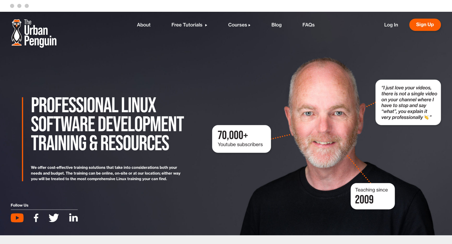
The Urban Penguin offers training and resources for the development software Linux. But, with over 74,000 subscribers on YouTube, it was time to upgrade his website to match the business’ growth.

A Snippet of
The Requirements
With numerous training courses, The Urban Penguin came to us with the idea of developing a platform where users can access a library of online training courses once they have purchased access. So, we took on the challenge!
YEAR
2022
MISSION
To design and develop a new website incorporating a bespoke online training platform.
TYPE
Web Design &
Web Development
project process
the initial stage
To begin, we decided to review The Urban Penguin. No, not the website nor the business, THE Urban Penguin.
To match the work which was to commence on the website, our designer decided to modernise the Urban Penguin logo. But the Urban Penguin was already cool enough, so we modified the typography and instantly knew this was all that was needed to elevate the brand.
Our designers also defined a distinctive colour palette. From Spanish Orange to Jet, we gave the business identifiable brand colours so they could use their brand correctly across all marketing material and sponsorships.
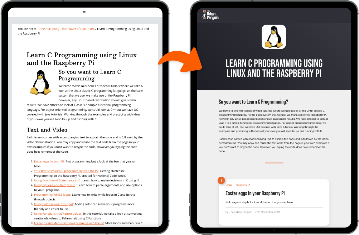
We then moved on to the website redesign. The website was very text heavy and lacked any definition between sections of content; therefore, we needed to redefine the content structure.

BEBAS NEUE Pro
Bebas Neue is a display family suitable for headlines, captions, and packaging, designed by Ryoichi Tsunekawa. It’s based on the original Bebas typeface.
Spanish Orange
#FC5D01
Jet
#2F2F37
Light Grey
#CCCCCC
White
#FFFFFF
project process
next steps
Once a refreshed and streamlined design was signed off, we began building the site, introducing new functionality – an online training platform.
We needed to build a bespoke online training portal to meet the requirements. Therefore, we made sure to understand what elements the client wanted to be part of the portal, which details are accessible to all users, and which features are only available to course-purchasing customers.
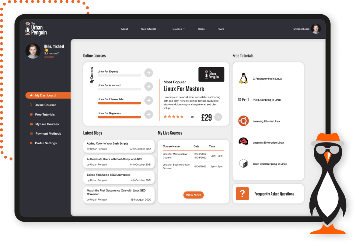
The E-learning platform was the site’s newest feature, as there was no equivalent on our client’s old website. We wanted to ensure this was a slick, easily navigatable part of the site on both mobile and desktop. As well as displaying which course packages were free, ones running live and member online content. We designed and developed a full dashboard showing upcoming essential dates for live courses, a progress icon and clear links to more information.
