A future-focused design
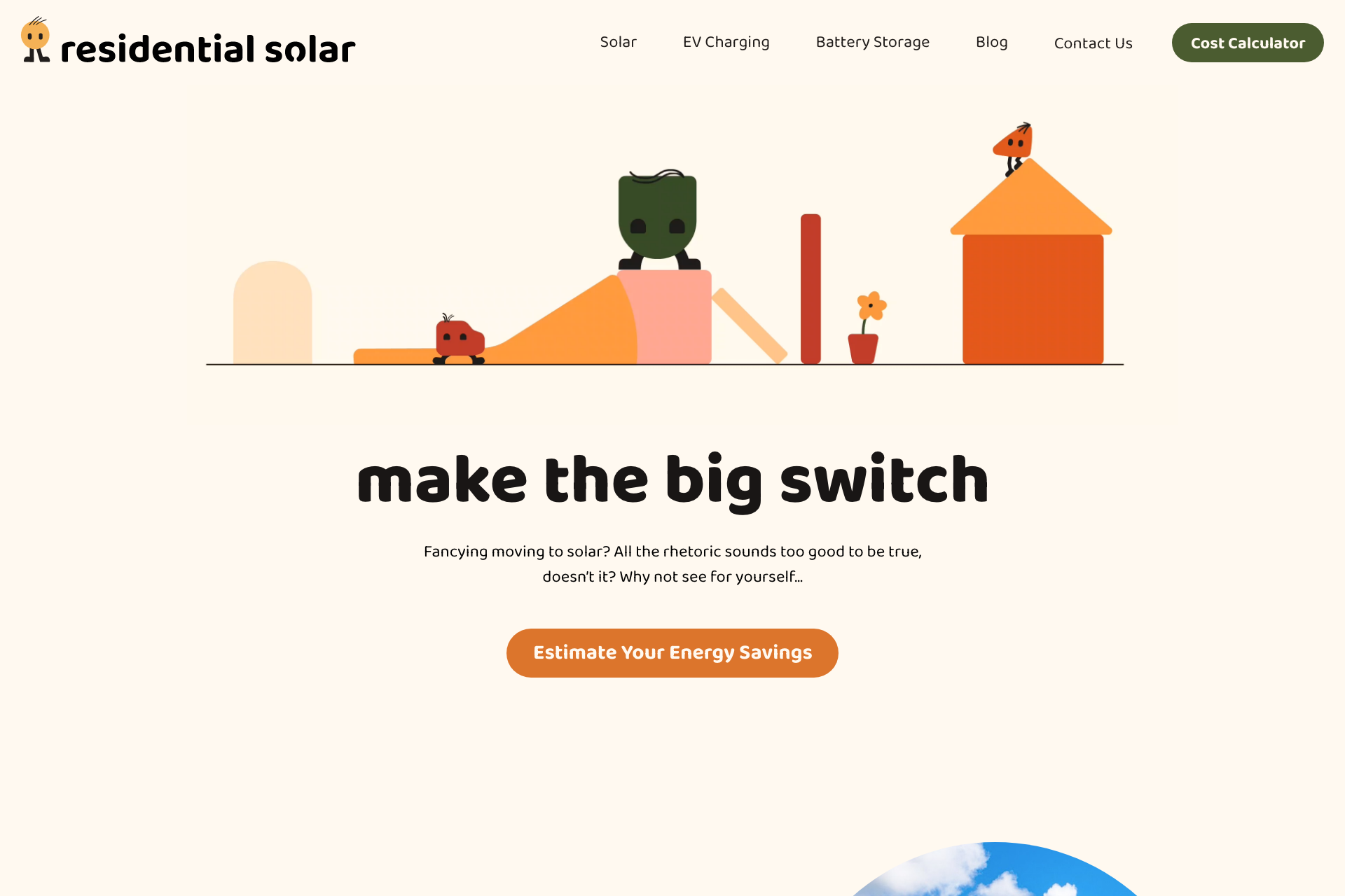
When evaluating the depth of a rebrand project, we always begin by checking the competition and the current branding trends. From the beginning, we saw that there was a gap in the solar industry that was aligned with users’ expectations for branding. So, we took Residential Solar’s brand and created a future-proof brand. While they may be a new company, we wanted branding that established them as the solar brand. We decided to push towards a more playful design that would be memorable and easily recognisable in the industry.
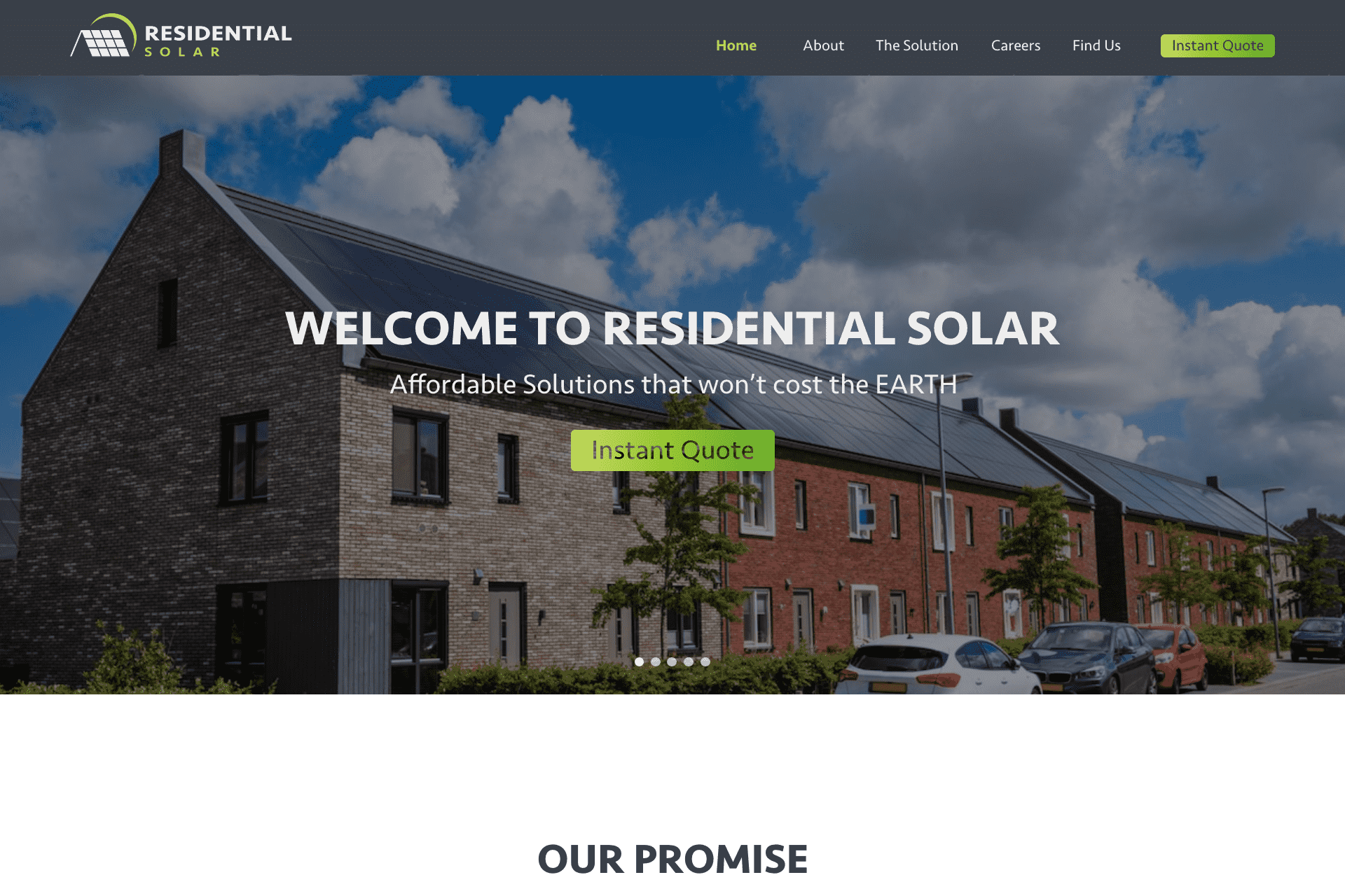
Before
After


Design Exploration
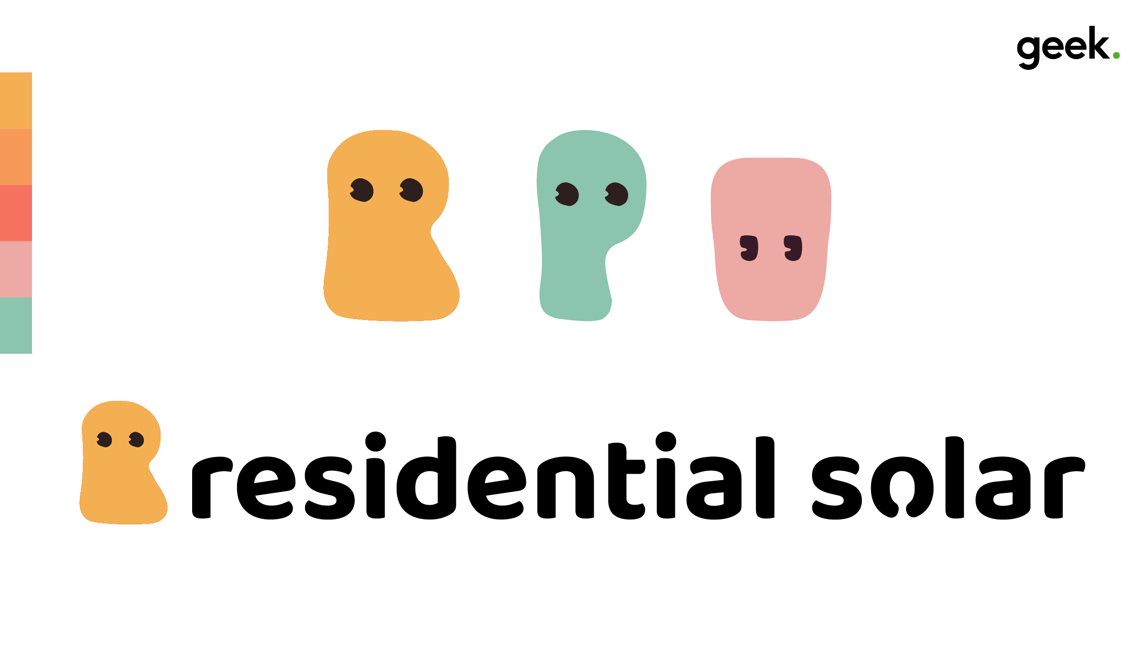
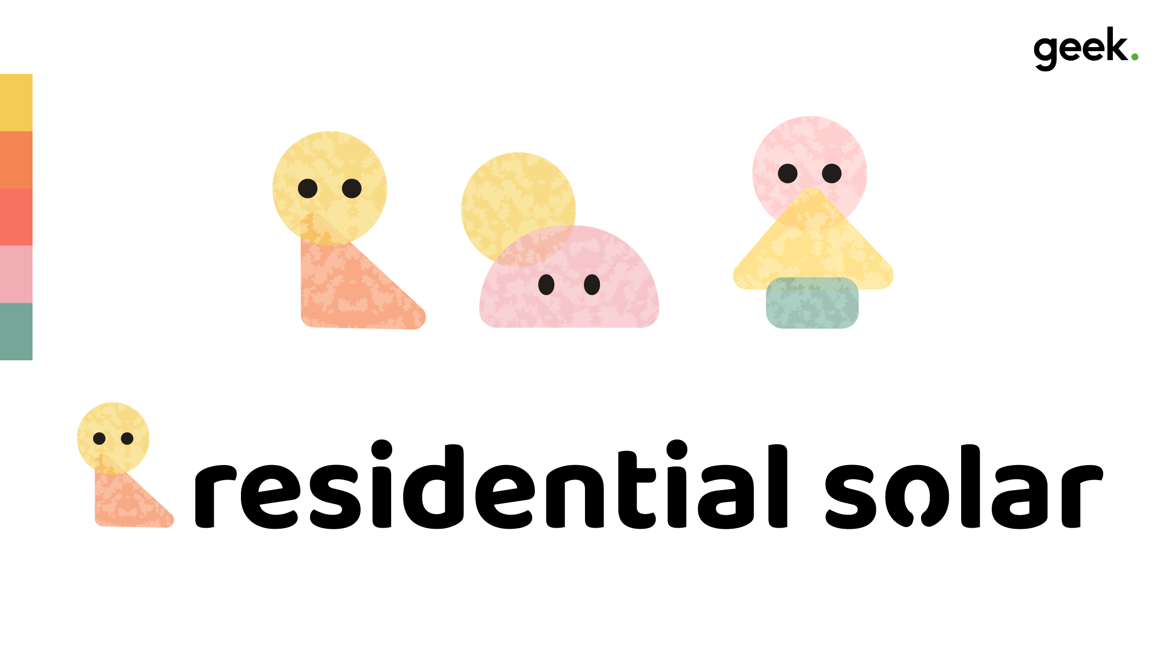
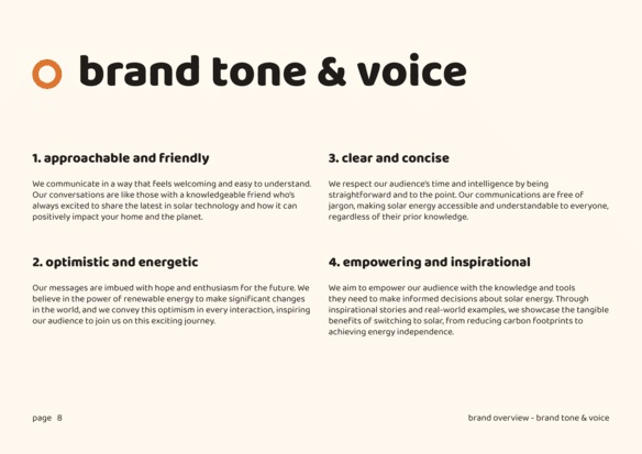
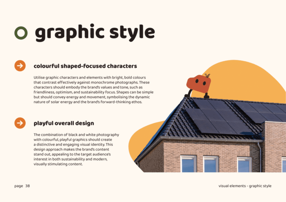
There’s a lot of fluff around solar, and said fluff can alienate the audience, we determined the branding needed to be approachable. To achieve that, we started by working on a few concepts for a character lineup. We chose to use simple shapes and a diverse colour palette, a growing style within recent branding, so rather than playing catch up in a few years, we decided it was time to bring Residenital Solar to forefront.
Logo
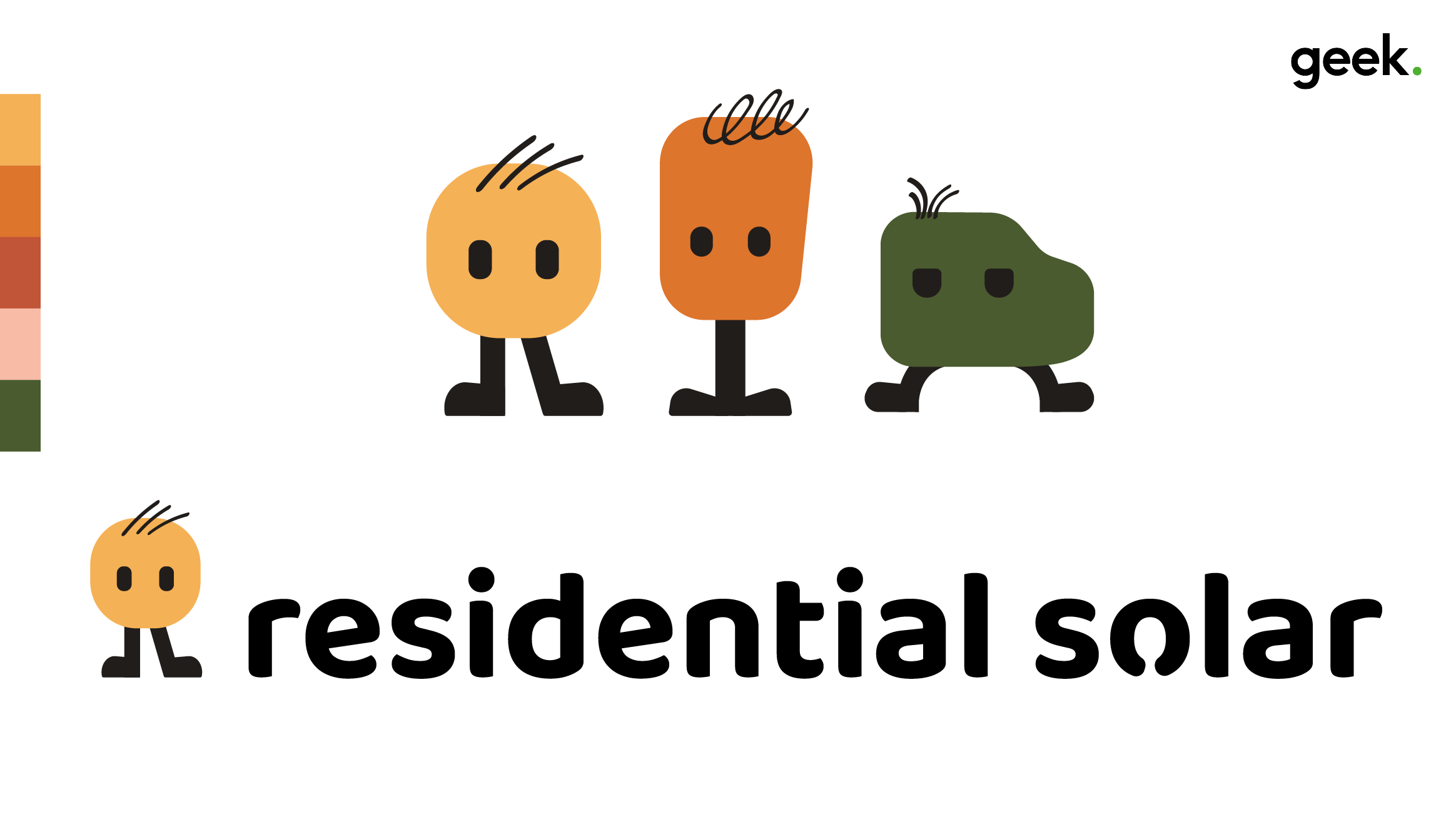
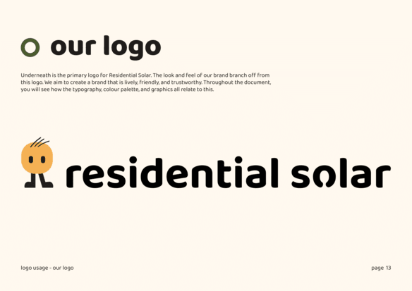
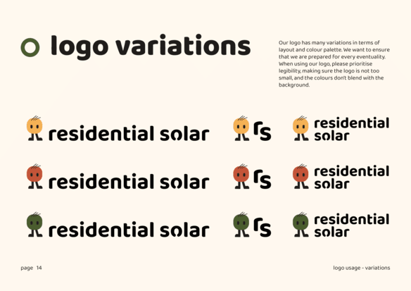
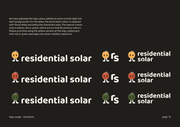
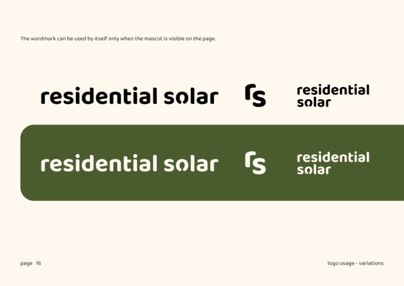
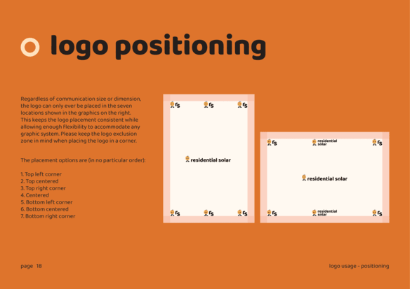
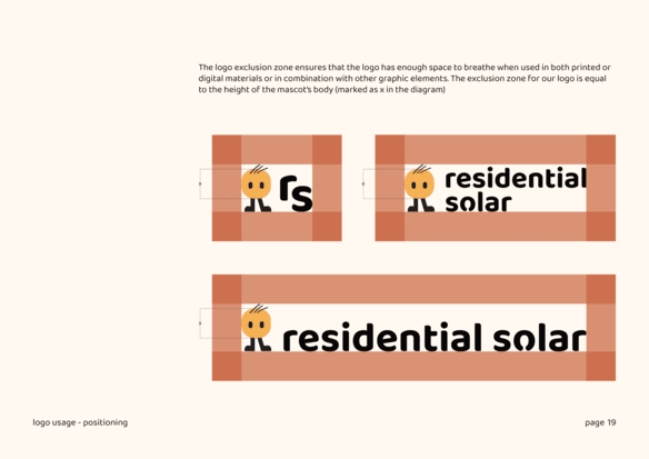
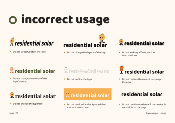
Once we decided on a style for the characters, we created the logo. As you can see below, the new logo consists of a mascot and a wordmark in a playful font that will be used throughout the branding.

Mascot
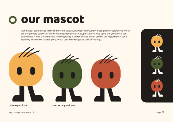
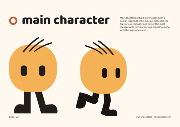
The mascot is an important element of the Residential Solar branding. The yellow circle represents the sun, and when used in the logo, the mascot is standing in an R-like pose. To ensure legibility, the mascot can be used in the brand’s three main colours, which you can see on the left side.
Click on the buttons underneath the mascot to explore both light and dark versions of the design.


Colour Scheme
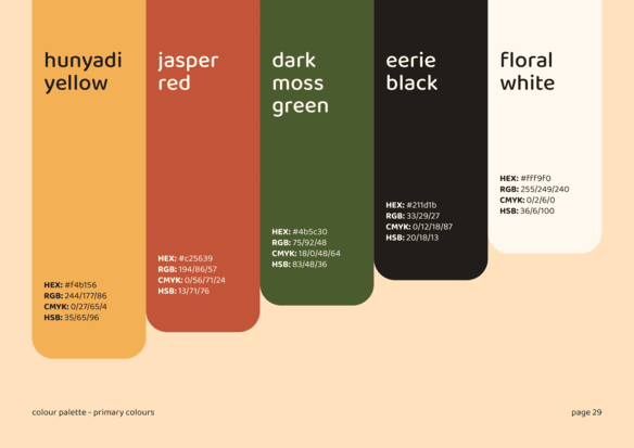
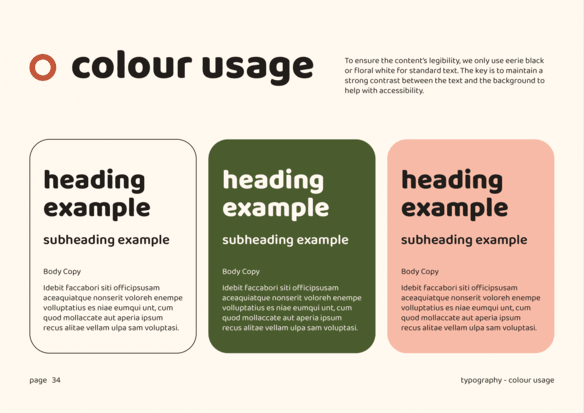
Dark Moss Green
#4b5c30
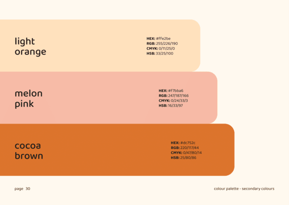
Naturally with anything that focuses the enviroment, green tends to be leading colour. Still, due to the difficulty of using green within design, we opted for a dark, muted green, to which we added red and yellow to create the primary colour palette. The large number of characters and the playful nature of the branding led to the creation of a secondary colour palette, including shades of orange and pink.
Jasper Red
#c25639
Cocoa Brown
#dc752c
Hunyadi Yellow
#f4b146
Melon Pink
#f7bba6
Cocoa Brown
#dc752c
Melon Pink
#f7bba6
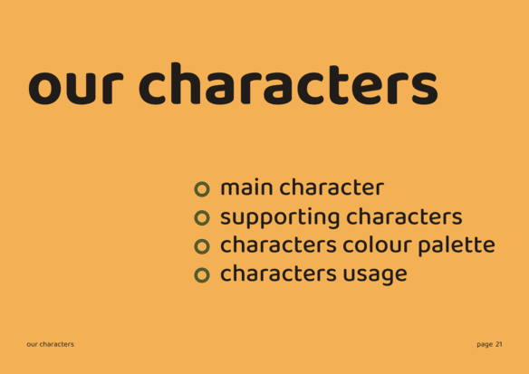
Characters Lineup
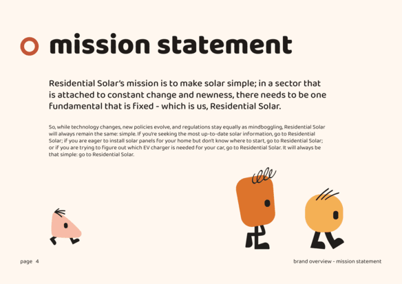
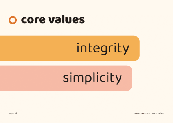
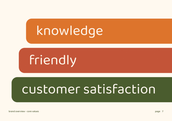
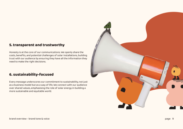
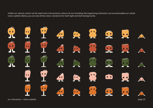
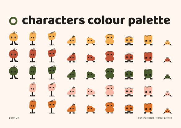
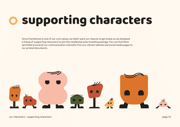
We had a lot of fun creating this character lineup for Residential Solar. We wanted them to come in a variety of shapes and sizes, so before we realised it, the collection grew to nine designs. With the exception of the main mascot, which can be used only in the primary colour palette, all the other characters can be used in any of the brand’s colours.
Click on the dots to explore more colours.
Click below to explore other colour options
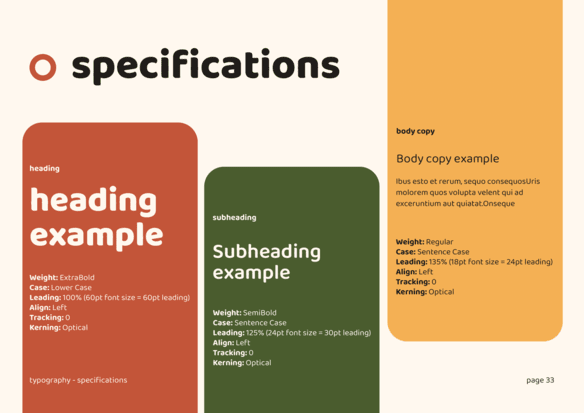
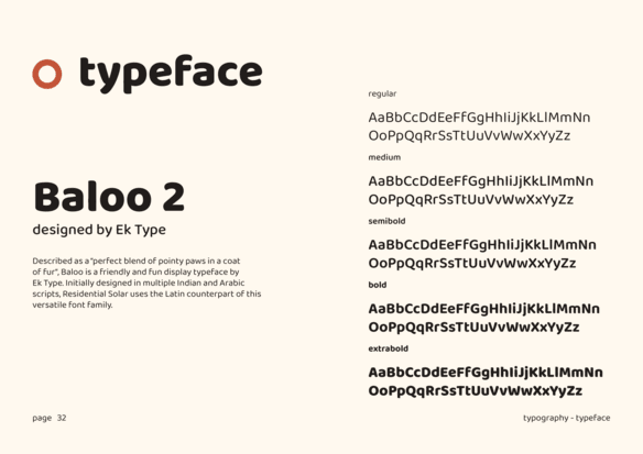
Typography
baloo 2
baloo 2
Make the big switch
Aa
Graphics
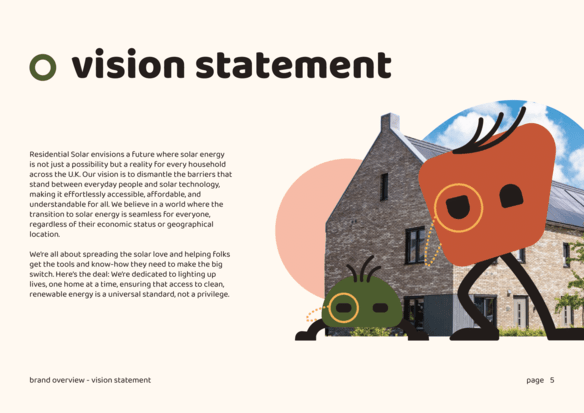
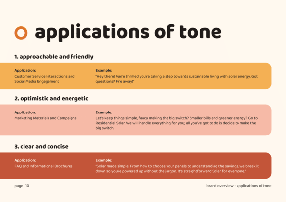
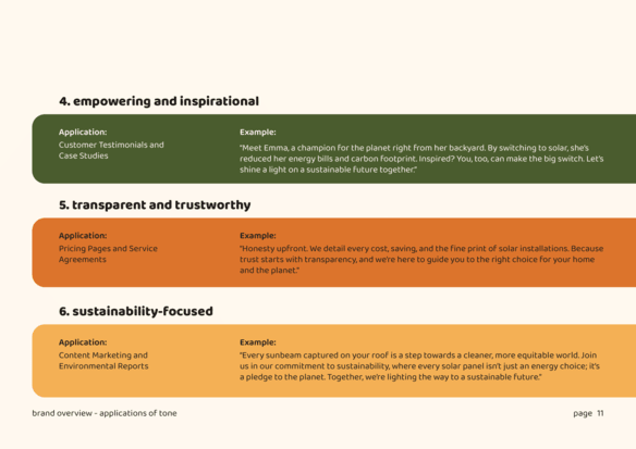
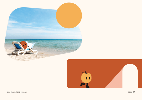
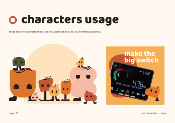
Another important feature of the Residential solar branding is the imagery. The images are made in a collage style, combining bright photographs, various graphic elements and the brand characters to create engaging scenes and tell stories.


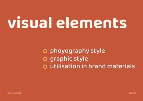
Brand guidelines
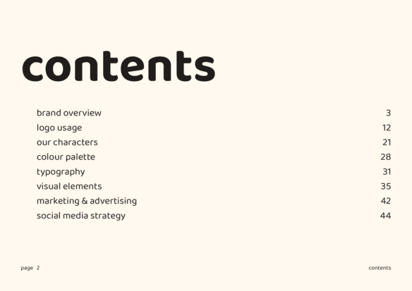
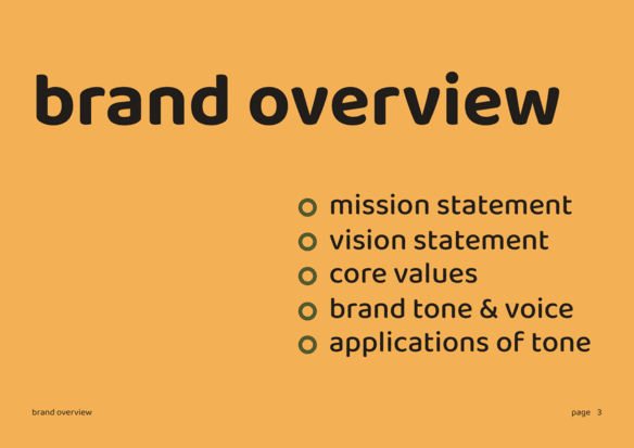
The serious part – bespoke functionality
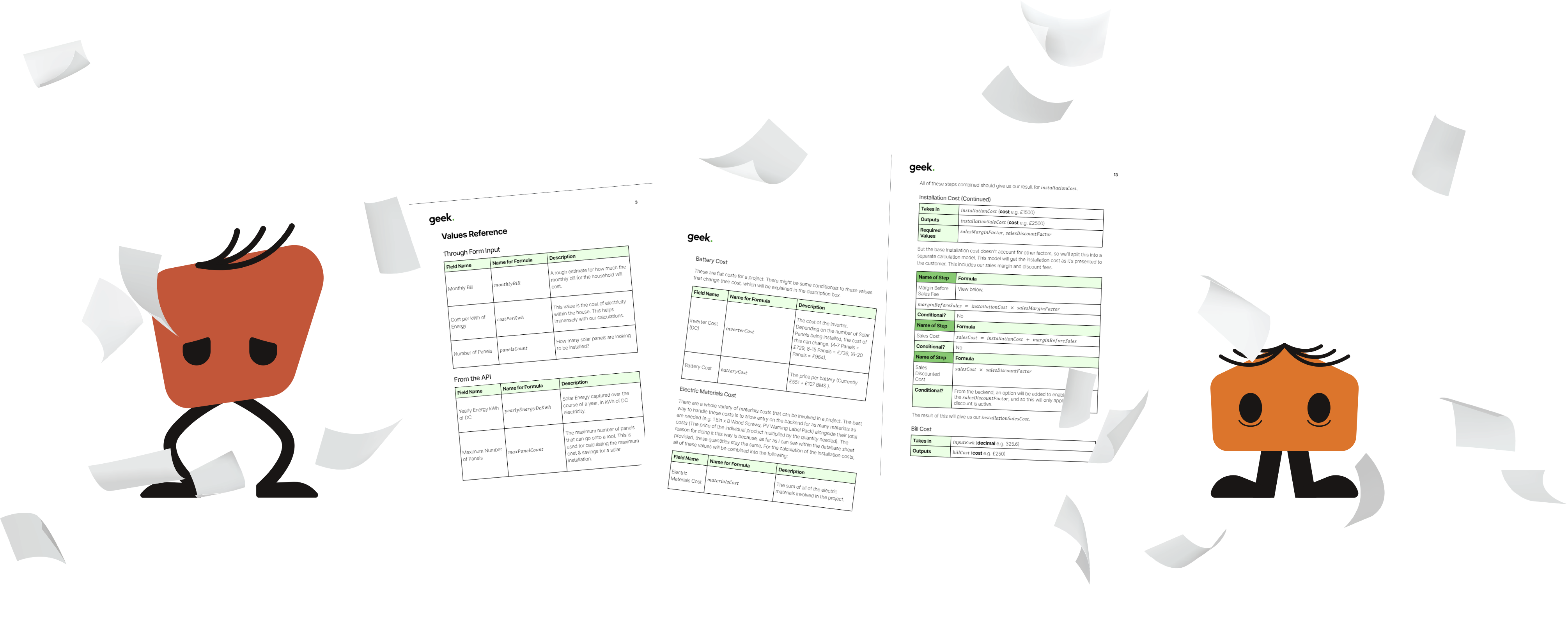
As you can see, we had a lot of fun with the branding—perhaps too much fun—but with every reaction, there is an opposite reaction. For this project, it was the functionality of the Cost Calculator.
The Calculations
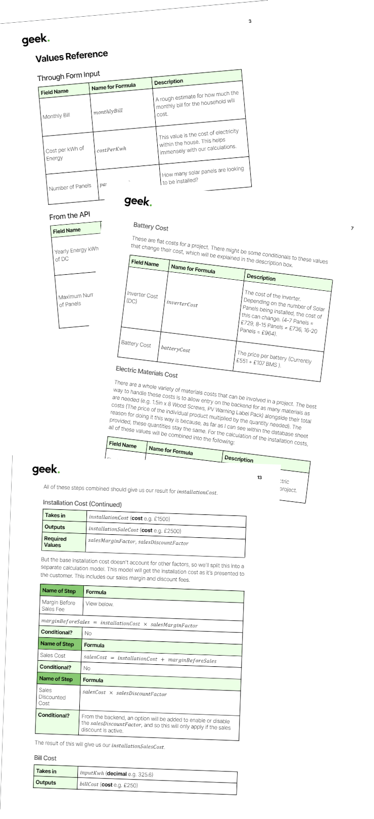
We started by analysing the functionality of the Google Solar API so that we could combine our calculations alongside theirs and develop a specification for the complex calculations needed and what data on the form we would need to capture.
API after API after API
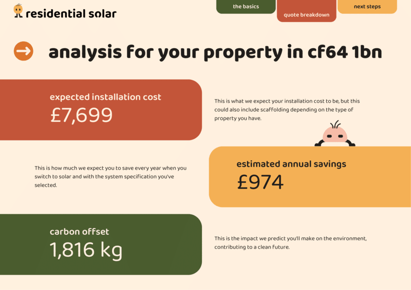
In order to do this as well, we incorperated other Google APIs, such as the Google Maps API and the Google Places API, to allow the user to enter an address and get a preview of their house to confirm their location. On the results page, the user is able to adjust the details of their quote and get an idea of how different system sizes affect their costs and savings.
The final step
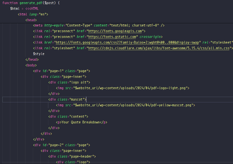
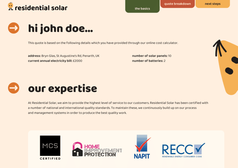
We also integrated a PDF library to write scripts to transform into custom PDFs, allowing us to send the user a PDF presentation of their quote and highlight all of their details and results.
This information also passes through into their own CRM systems, which allow them to handle the quotes as projects and track their ongoing development.
See More
