
Read on to uncover hidden messages and interesting logo facts within famous companies branding…
Read on to uncover hidden messages and interesting logo facts within famous companies branding…
Have you ever wondered why a logo looks the way it does? Yes, you notice logos every day, but have you ever looked carefully? Well, in our line of business, every little detail is apparent to us (we do design logos for a living, what did you expect?)
We love coming across smart designs and exciting facts about the development, and we think you’ll be fascinated too! Therefore, we have compiled together 19 logo facts about the hidden and secret messages of some of the world’s most famous logos. So, prepare to have your mind BLOWN!
Let the logo facts begin! So say hello to the grandmas of the logos
The origins of the famous beer can be traced back to 1366 – yes that long ago – when it was known as Brouwerji Artois. But, the company renamed to the title we know and love today – Stella Artois – in 1708. With only slight alterations, the logo remains the same as it did in these humble beginnings.
The design of their logo reflects the beer’s origins from the city of Den Hoorn, Belgium. Well, Den Hoorn is Dutch for “the horn”. This is why the infamous logo features a brass horn at the top of the crest! Makes sense now doesn’t it! The closed brewery lives on in the shape of the trumpet, proudly at the top of the logo. Additionally, the fancy frame around the brand’s name is representative of the style of Flemish architecture around the city.
So, next time you grab a can of Stella from the fridge or order a pint at your local pub – take a look at the logo!
Gaining the silver medal and coming in a not so close second place is popular tea brand Twinings. The tea company has been using the same lion crest logo for over 230 years! However, even more, remarkable is the fact that the company is STILL family run! Passing down 10 generations, and occupying the same London Strand location since it’s founding.
Twinings is now a globally recognised and currently distributes tea to over 100 countries worldwide – not bad publicity for an old logo eh!
From splashing that cash to saving pennies – the most expensive and cheapest created logos
The original and highly recognisable logo only cost $15! The owners brought the logo of iStock from a logo designer called Simon Oxley – who sadly only received $6 after iStock took their cut! Although recently Twitter has undergone a makeover, the iconic blue bird still remains the focus. Another fun fact – this little bluebird even has a name. He is aptly named Larry Bird.
Their famous swoosh logo cost them a groundbreaking $35. Co-founder Phil Knight commissioned Carolyn Davidson (a graphic design student who was studying at a University in Portland) to design their all-important logo.
However, Knight wasn’t happy with the design but regardless used it anyway. Years later, after realising his misjudgement, Nike rewarded Carolyn a ring embedded with diamonds in the shape of the famous swoosh for her creative efforts! Not bad for a flick of the wrists.
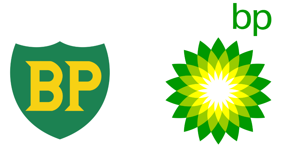
The oil and gas company spend a whopping $211,000,000 on the re-design of their logo. BP had been using their previous shield inspired logo for over 70 years. But, in 2010 the company decided it was time to replace it with their newly designed ‘Helios’ logo. The only element that to remain from the previous logo was the green and yellow colour scheme. Why these colours? Well, they represent growth and energy (you should know that from our last blog 😉 ).
The American software company and global leader of cybersecurity broke the bank when designing their new logo. Symantec spent over A BILLION dollars on their re-design and re-branding campaign. This enormous cost was mainly down to establishing a foothold after buying out their competitor VeriSign – but still!
Symantec wished for their logo to as recognisable as Nike’s tick. However, this was not the case, and the company realised the re-brand failed to propel the company. Today, the firm is not struggling to reposition itself on the market. So, be careful when purchasing your new logo – it could bust your business.
Disney is one of the most iconic brands to exist. Their logo, which features in every opening scene for any Disney film depicts Cinderella’s castle accompanied by an instrumental version of “When You Wish Upon A Star”. The first film to feature this combination was ‘The Black Cauldron’ in 1985. But, in 1995, in the opening credit of Toy Story, the logo was changed to feature an animated castle to match the style of the Pixar animated film.
So, after the positive fan reaction, Disney decided to alter their opening logo to reflect the context of each film! In 2006, for ‘Pirates Of The Caribbean: Dead Man’s Chest’, the first fully 3D version of the castle was used. Plus, in 2011 the ‘Walt’ was dropped entirely! Check out some of our favourites below:
The sought after BRIT award statuette is inspired by Britannia, the female personification of Britain. Every year, the prize is re-designed by some of Britain’s most famous designers, stylists and artists. The awards show logo continually features Britannia silhouetted out of the ‘B’. But, this shape is updated to reflect the changes to the statuette. I bet you never noticed that before!
However, even though this may be a fun hidden message logo, it doesn’t beat Madonna falling off the stage at the 2015 BRITs. Not one bit.
Get your magnifying glass out as these logo facts are about secret messages…
The triangular chocolate makers base is in Bern, Switzerland. Fun fact time again, Bern is also known as ‘City of Bears’ and has a coat of arms featuring a bear. PLUS, Bern is also home to the Matterhorn Mountain. Therefore, Toblerone decided to add a nod to their roots in their logo.
So, next time you’re in duty-free, and you find those outrageously large Toblerone bars, take a peek at the logo to see the bear!
At first glance, it may be the Tour de France logo may simply be handwritten text. But, if you look closely, the logo contains a hidden cyclist. Can’t see it? Don’t worry; we couldn’t straight away! Take the ‘R’ of the tour; this is the person riding the bike; then the wheel is the ’O’.
Another hidden subliminal message in the logo is the use of colour yellow. Why? Yellow is synonymous with summer and the winning jersey of the race!
Unsure what we mean? Take a closer look at the Unilever logo. Notice anything?
The British-Dutch consumer goods company has a portfolio of well-known brands within hygiene, nutrition and personal care. Their interesting and clever logo, therefore, represents their products and services. The ‘U’ shaped logo features icons as visual expressions such as hair, a hand, clothes and a recycling logo.
German company TUI, which stands for Touristik Union International, cleverly features a smile and winking face. But not many people also know the logo is made up of the letters T, U, and I. Don’t believe us. Take a look at the image below.
Even more recently, TUI has adopted the tagline, “We cross the T’s, dot the I’s and put U in the middle”, which gives a little nod to their famous logo.
No, we don’t mean LITERALLY inside a Hershey Kiss, but within the logo! One of the American confectionery company’s biggest sellers is their bite-size pieces of chocolates branded as Kisses. Their distinctive teardrop shape is synonymous with the brand. So much so that there is, in fact, a hidden kiss within the treat’s logo. The negative space between the “K” and “I” creates a sideway Hershey Kiss.
Finally, some logo facts that we just couldn’t ignore and let you miss out on!
We did too! The clothing company that specialises in surfware, of course, wanted to showcase this in their logo. So, if you wanted to include a wave in your logo, you’re going to include the most famous wave!
Therefore QuickSilver decided to incorporate the famous Hokusai’s woodcut – ‘The Great Wave Off Kanagawa’. It’s that popular, even one of our staff has it as their computer’s wallpaper!
Their logo directly references this, featuring a large wave with a mountain, on a red background. Now that’s a logo fact you can impress your friends with!
Roxy began as an offshoot brand of QuickSilver in 1990. They sell clothing and accessories gendered towards women. Therefore, without changing branding completely, the design team at QuickSilver cleverly designed a newish logo. Combining two QuickSilver logos and turning them on their sides – Roxy’s heart logo was created! Who would have known!
As one of the most iconic logos in the world, everyone can identify the Apple brand. You may even be reading this blog on an Apple device! There are SO many logo facts about Apple’s apple. So here are just a few of the juiciest.
Even though Steve Jobs was famous for his attention to detail, Apple’s branding wasn’t the top priority initially. Therefore, its original logo was an elaborative drawing by Ronald Wayne. As you may see, the graphic features the scientist Isaac Newton. A nod to the discovery of gravity by an apple hitting Newton on the head while sitting under a tree.
But, after only a year, it was time to rebrand the logo. In 1977, Rob Janoff took on the challenge of rebranding the emblem. The new apple represents knowledge, diversity, creativity and inspiration. Additionally, the colours took inspiration from a screen’s colour test bars! But, according to Janoff, he did not prepare another concept – he only had one design idea. Luckily, the risky move paid off! The logo remains today, only ever being altered slightly.
Furthermore, we can address the popular question, why does the apple logo feature a bite out of it? According to legend, Janoff suggested an image of an apple with a “bite” so people would not confuse it with other fruits. But, another reason indicates that the bite is a symbolic pun with a byte – a unit of digital data. OR some argue the idea goes back to the time of Adam & Eve, who bit from the apple of knowledge. Therefore, the image suggests a human’s thirst for knowledge, and using Apple products would help people gain knowledge and quench it.
Over the years, we’ve seen the evolution of Amazon. With that has come the development of its logo. When first founded in 1994, the Amazon logo was a visual representation of the name, literally. Displayed was the capital letter A, with a river running through it, with ‘Amazon.com’ underneath, and the slogan ‘Earth’s biggest bookstore’.
However, this changed pretty quickly in 1997, with the letter A removed and the amazon.com font change. Although the slogan remained the same.
1998, Amazon’s logo had a complete overhaul.
It’s safe to say that this didn’t work, as a new logo was introduced just later that year. Many felt it made Amazon feel like an unapproachable brand, and couldn’t understand the use of the big circle, acting as the ‘o’ separating ‘amaz’ and ‘on.com’.
Amazon reverted back to its lowercase version, although a new font. Also added was a curve. Many companies have a curve incorporated into their logo, as it conveys forward-thinking. Along with the orange used, which evokes a sense of joy and happiness. This logo clearly worked, as it remained from 2000-2012.
Although, as Amazon was becoming more of a household name, and started moving beyond just online, it felt time to change the logo. Hence why the ‘.com’ was removed. The orange curve was also changed slightly to a curved arrow, looking very much like a smile. Furthermore, the arrow was placed from the letter a to z. This to suggest that Amazon can do and offer anything from a – z. This arrow has become pretty iconic, so much so Amazon felt they were able to put just the arrow on their delivery packaging, which proved to be enough for people to know that it was from them.

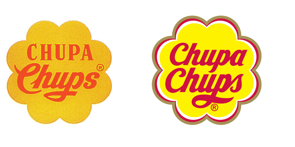
We MOUST-ask, can you guess who? None other than Salvador Dali! (See what we did there?) The famous painter turned his hand to logo designing in 1969 when the company approached him. Dali incorporated the Chupa Chups name into a brightly coloured daisy shape, which has changed very little since. But sadly, this wasn’t the career path for him, and he went back to painting masterpieces!


What do Cadbury, Kellogg’s and Disney all have in common? All their logos feature their founder signature. Yes, really! Each logo features a stylised version of each name.
Cadbury’s script logo is based on the signature of William Cadbury and first appeared in Cadbury’s branding on their transport fleet in 1921. But, it wasn’t until 1952 that the all their major chocolate bars featured the autograph.
Kellogg’s logo is based on William Keith Kellogg. Previously, Keith Kellogg signed each Corn Flakes package personally to show customers that the product they were buying was a genuine Kellogg item. Eventually, the Kellogg company decided to use this signature as their company logo. Only retouching it slightly and colouring it red!
Finally, arguably, the most famous signature-based logo is based on Walt Disney’s writing style. The Walt Disney Company continue to this day to use the stylised signature as its logo. But, after the decision to use Walt’s signature, Walt Disney himself stopped signing his name this way as he grew to dislike it.
However, it remains synonymous with the brand. Even to the point where all Mickey Mouse characters at every Disney park must sign their name using the same Disney signature font. Even down to the exact swirl above the ‘i’.
Not only have we blown your mind with some ingeniously hidden messages, but we have also demonstrated the importance of a logo, the thought AND consideration that goes into each design!
So, next time before you dive into that chocolate bar, or settle down to watch a movie – take a closer look at the logo, you might be surprised with what’s there…
Did you gain any value from this blog post?