Through a wealth of online resources and networks of support groups across the UK, the PSPA aims to ensure no one has to face PSP or CBD alone.

The Progressive Supranuclear Palsy Association (PSPA) is a national charity in the UK that provides support and information to people living with Progressive Supranuclear Palsy (PSP) and Corticobasal Degeneration (CBD). PSP and CBD are both rare, progressive brain conditions that cause problems with movement, balance and vision.
As a charity, the PSPA aims to improve the quality of life for people with PSP and CBD through key activities such as funding and promoting research projects focused on understanding and treating PSP and CBD and raising awareness about PSP and CBD among both healthcare professionals and the wider public.
Refresh Functionality
Revamp Homepage
Enhancing accessibility
Modernise User Experience
The Pain Point
With both conditions, PSP and CBD, gradually worsening movement and eye movement issues, PSPA knew that their website required a redesign to become more accessible to their demographic.
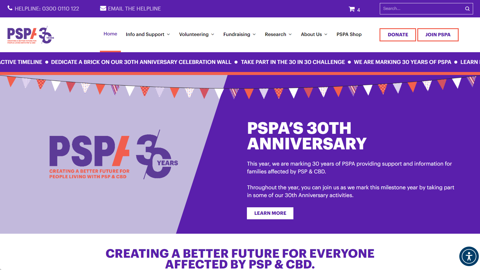
Enhancing accessibility was the driving motivation behind PSPA’s website redesign project. But they also wanted to modernise the user experience, refresh outdated functionality, and revamp the dated-looking homepage. While accessibility was the primary focus, improving the overall user experience was also a key goal. The updates aimed to build upon that existing sitemap while layering accessibility best practices and design elements to better meet the needs of those with PSP, CBD, and related conditions.
However, when doing our initial research into the website’s backend, we discovered that the website’s theme and numerous plugins – including WooCommerce – were severely outdated, putting the website at risk of security breaches. As a result, before the website redesign and accessibility could be improved, we worked with PSPA to update the website and various plugins.
The Solution
Firstly, we made a copy of the website to update the necessary plugins and software. Whilst updating the variety of plugins, our development team kept an eye on the website to monitor the impact of what they were editing. If a major update “broke” the website, our developers were able to fix the issue without affecting the live site. This resulted in no downtime and user frustrations. The purpose of this process was so that when the website redesign took place, we knew we had the infrastructure to make the necessary changes to make a beneficial impact.
Homepage Redesign
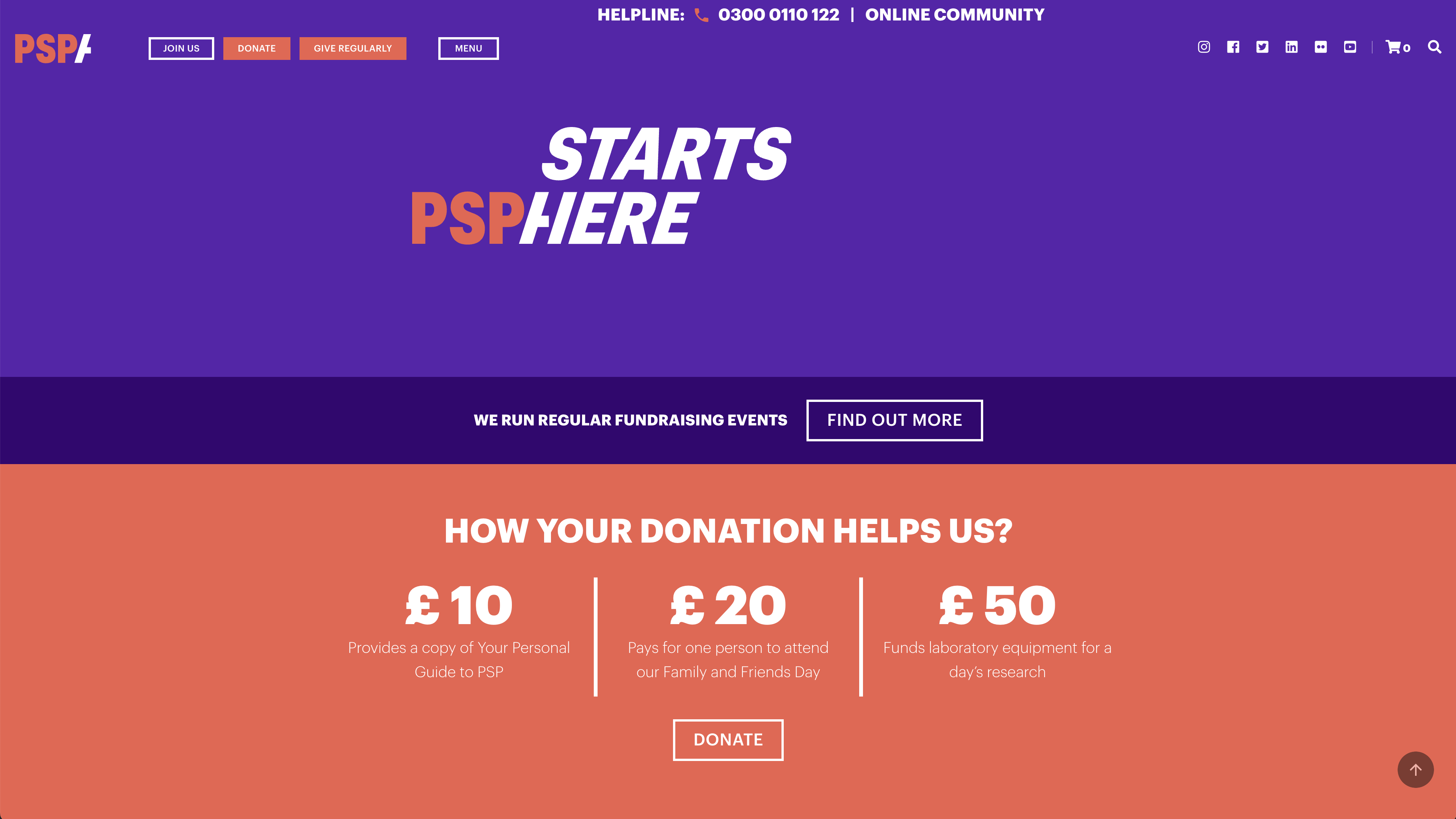
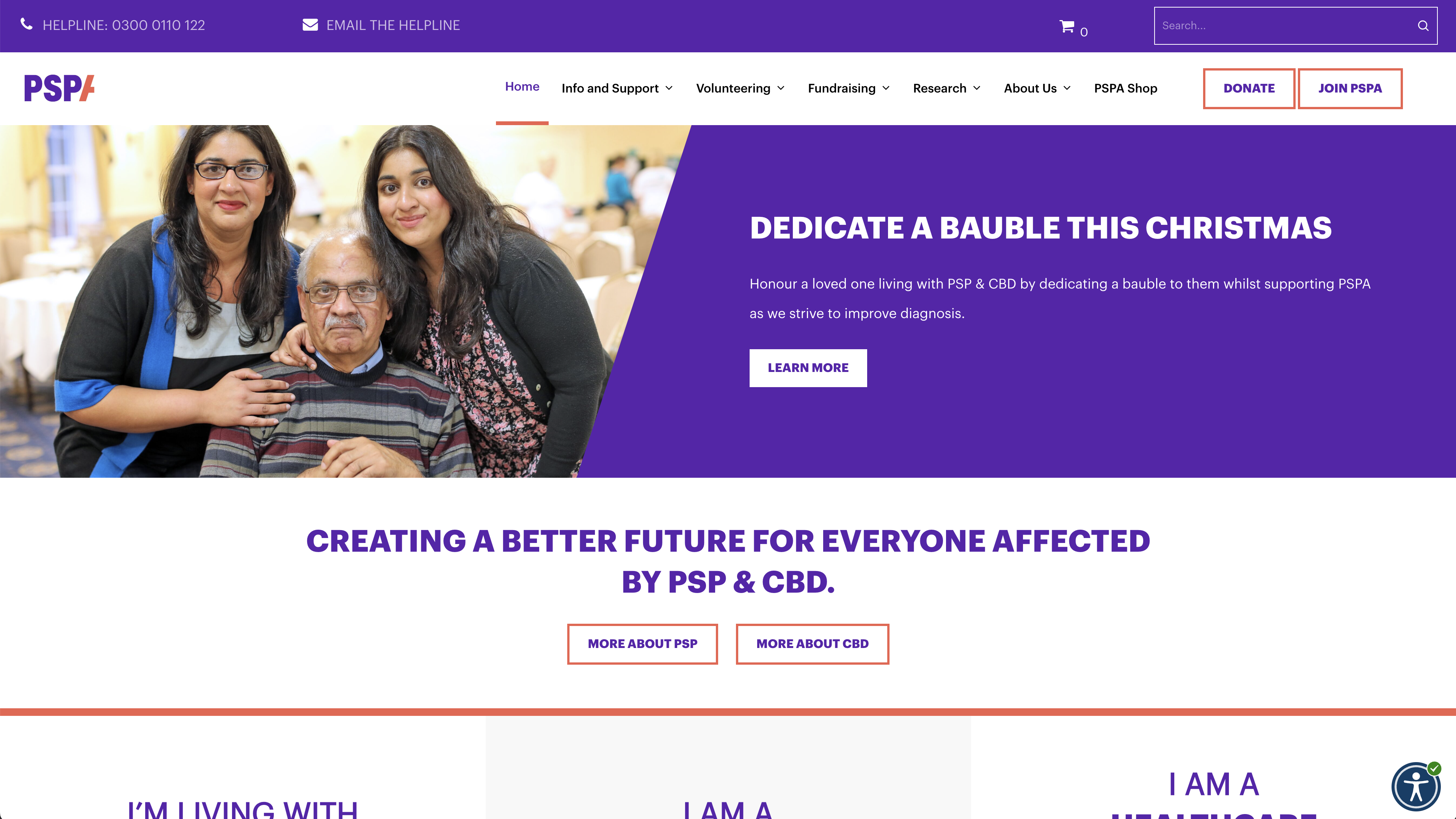
Before
After
Accessibility
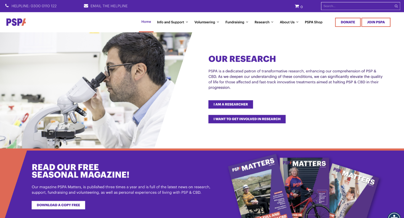
Once the website was updated successfully and was in place to be worked on, we began the redesign. Following discovery discussions with the PSPA team, we understood their requirements of ensuring people with PSP and CBD could access, view, and navigate the site to find support and information. With this being a key factor for the project, we followed WCAG guidelines to safeguard the designs to guarantee they complied with web accessibility guidelines. Through the pursuit of accessibility for their site meant removing already established animations and replacing them with subtle, accessible, micro-interactions.
However, as PSPA are a charity with a committee, we decided to design two versions of the site’s navigation for the PSPA team to conduct research with. The PSPA committee planned to have volunteers and people with PSP and CBD use both site versions. The volunteers would go through the navigation and provide feedback on which version they found clearer and easier to use for finding information.
Try it out for yourself
User experience
The two navigations needed to encompass PSPA’s extensive sitemap. With the website having many pages, we proposed a mega menu. Mega menus are an expandable menu in which many pages are displayed in a two-dimensional dropdown layout. They are ideal for accommodating a large amount of information or revealing lower-level site pages at a glance. The mega menu would split the navigation into links and visuals, clarifying the information and user journey. After discussing this design option with them and showing them various inspirations for the design, their favourite being the Geek Designs menu, we began working with accessibility guidelines to design two mega menu concepts. The first-hand research provided insights into which navigation design was optimal for the target audience, with the favourite being built.
However, with further internal testing and feedback, PSPA asked if we could simplify the menu even more. Instead of the visual and breakdown menu structure, they wanted all information in one click, aiding those with mobility issues. As there were many details to bring into the menu, we split each section into separate headings with relevant pages underneath. This simplified hierarchy enables those who suffer from PSP or CBD to navigate the site quickly and confidently.


Throughout the project, we kept the needs of PSPA’s target market in mind to ensure the website would suit their conditions. With the menu being the pivotal part of the site’s architecture, it was vital all information could be accessed quickly and easily. The website’s objective was educating people, so the menu needed to continue this user journey seamlessly. The team at PSPA can now update the website effortlessly and add / remove information with ease. Enabling them to always accommodate and respect the needs of their audience.
Continuing work
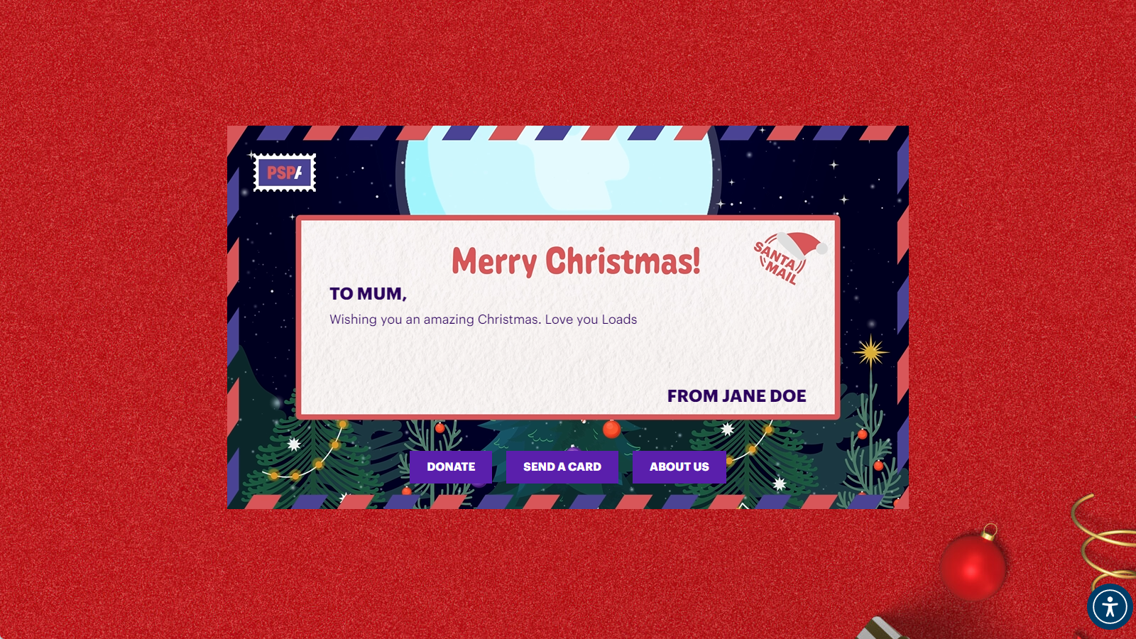
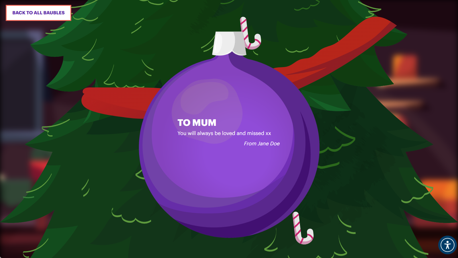
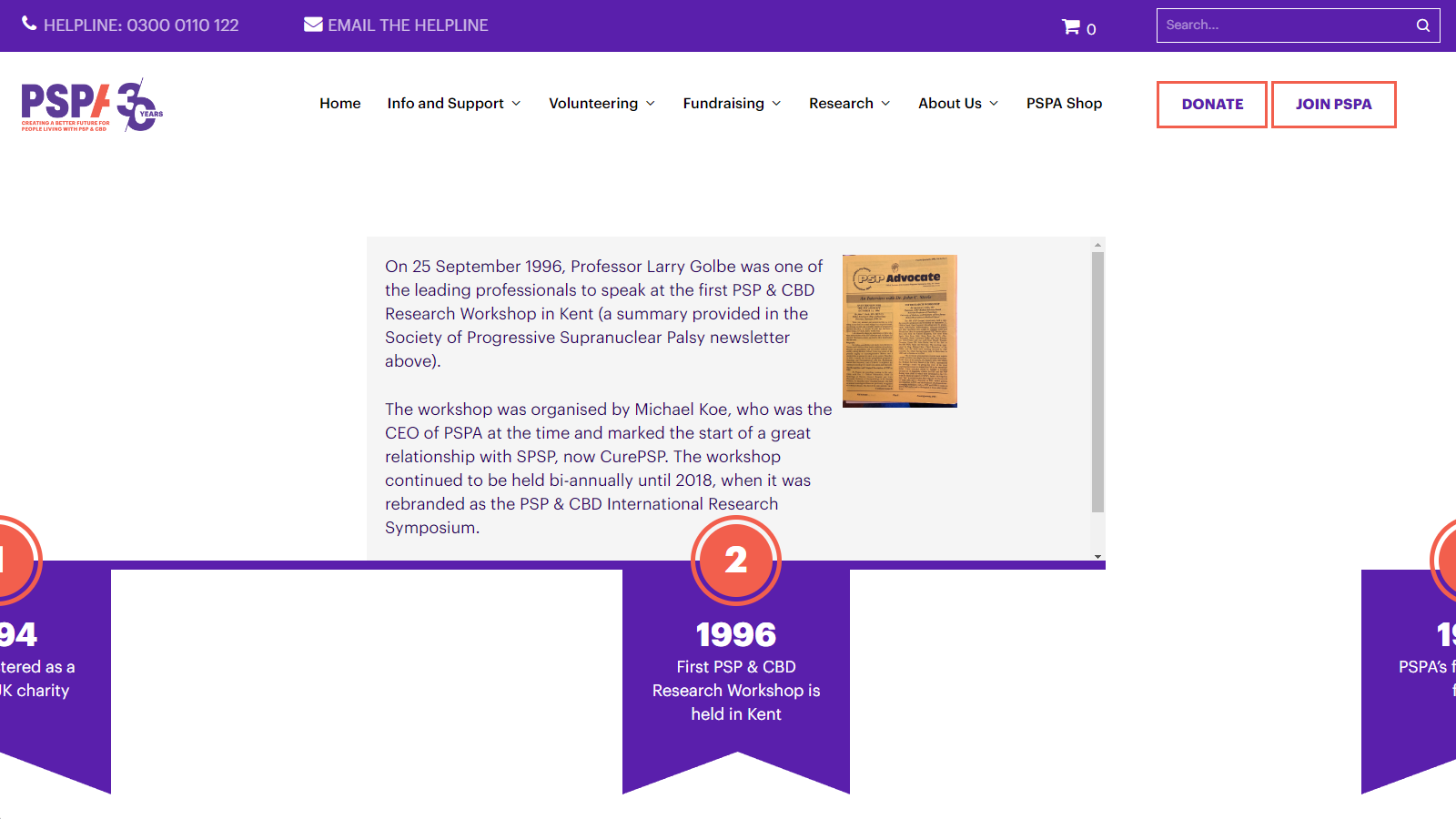
Since the website redesign project, we have continued to work with PSPA on various projects, such as designing brand elements for the charity’s 30th anniversary and the development of a bespoke feature which allowed donators to purchase Christmas cards and add decoration to a virtual Christmas Tree.
Our marketing team has made valuable contributions to strengthening the charity’s organic SEO presence. Through providing ongoing marketing services on a monthly basis, we persist in fine-tuning the website’s content, SEO titles and meta descriptions. The goal is to enable the website to be discovered by individuals seeking information from a trustworthy source on a critical issue.
By optimising the website for relevant search terms and ensuring the content answers searchers’ questions, we have succeeded in making the site more findable. As a result of our ongoing SEO efforts, we have managed to decrease the website’s bounce rate – the percentage of visitors who leave the site after viewing just one page. This indicates that searchers are finding the answers and information they need from the site.
Additionally, our work has also increased user engagement time on the website. Visitors are spending more time reading and interacting with the charity’s content. This shows the information is resonating with readers.
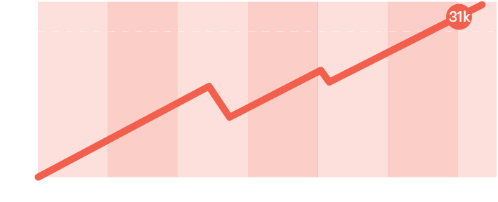
31k New Organic Visitors
over six months
See More


