PHI are an architectural design company specialising in bespoke, high-quality property design. We had designed their previous website, but they had outgrown this and needed a fresh, updated design that really showcased their skills.
A Snippet of
The Brief
We needed to create a striking but relatively simple website design that focused on showcasing our client’s work at the core. PHI wanted to retain their logo and colours. The bold use of red accompanied by black and white allowed important information to stand out whilst also providing a simple background for the extensive imagery to shine.
YEAR
2021
MISSION
Redesign the client’s website to showcase the skills and work of the client.
TYPE
Web Design & Web Development
Project Process
The Initial Stage
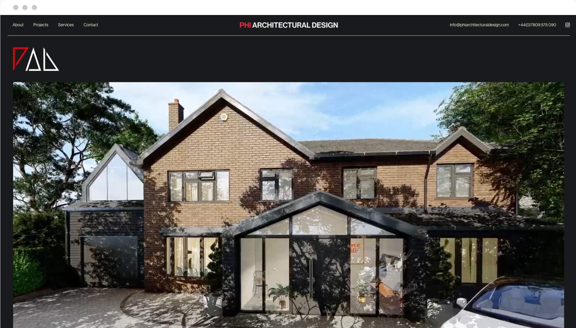
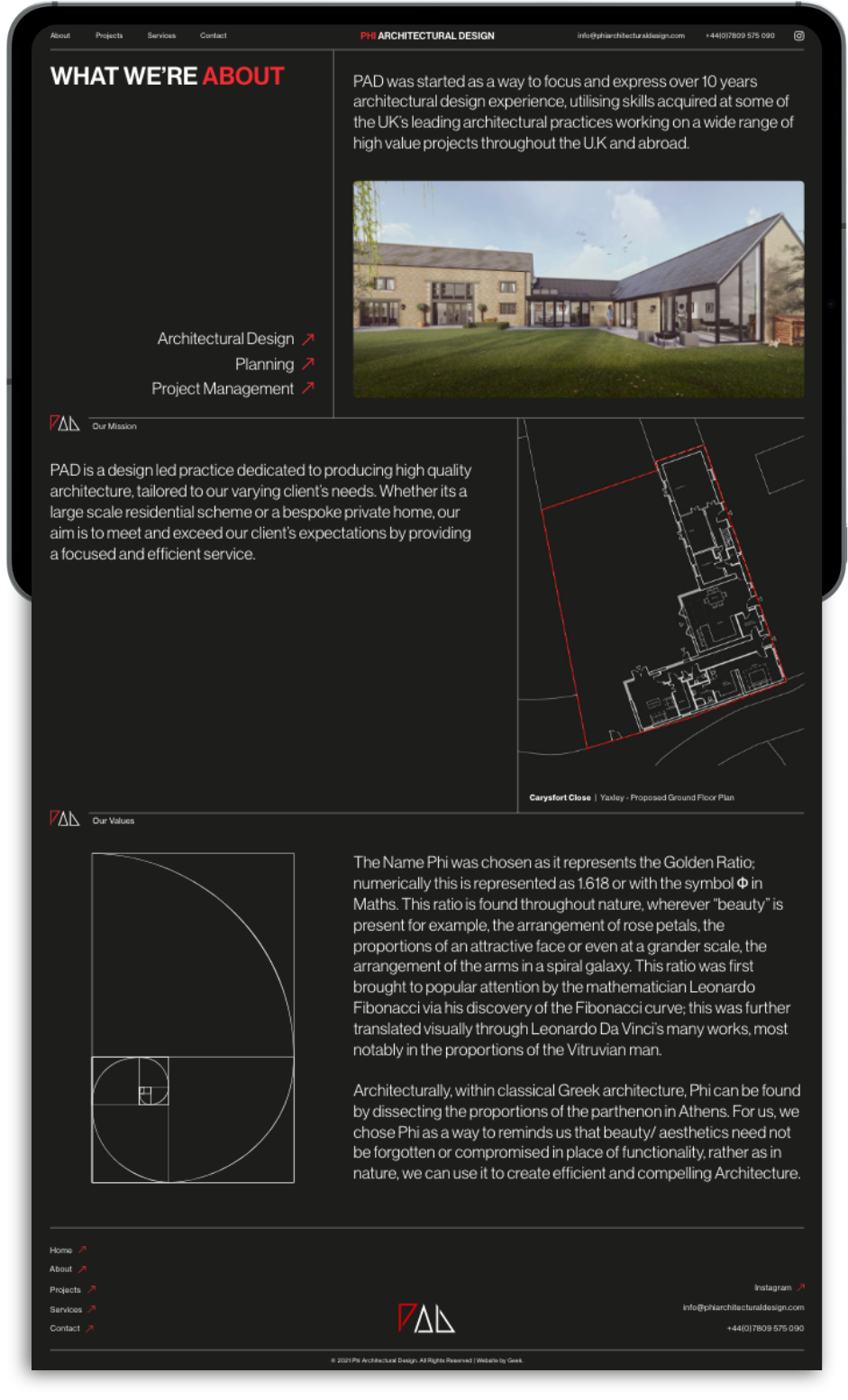
At the beginning of this project, we needed to design a bold and striking layout that really got our client’s message across. Lots of precise lines and architectural drawing imagery is used on this site to convey high-quality precision and show in black and white (quite literally) exactly what PHI does.
The main focus of this site was the client provided imagery, so we needed to make sure our initial site design kept that in mind. The images needed to fit seamlessly into the website without looking out of place and crowded, so our simplistic background design and linework incorporation worked perfectly for this.
Neue Haas Grotesk
The first weights of Neue Haas Grotesk were designed in 1957-1958. Neue Haas Grotesk was to be the answer to the British and German grotesques that had become hugely popular thanks to the success of functionalist Swiss typography. The typeface was soon revised and released as Helvetica by Linotype AG.
White
#FFFFFF

Imperial Red
#f4303b

Eerie Black
#1d1d1b
Project Process
Next Steps
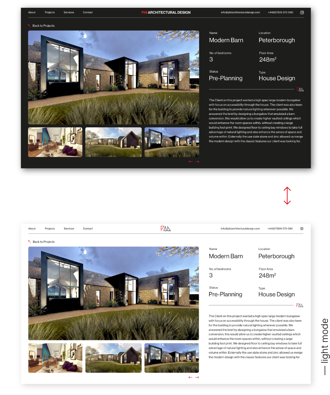
It was important to our client that the website had dark and light modes when building the site. Dark mode is a relatively new feature across many devices, designed to reduce eye strain when looking at websites. There is also some research to suggest that viewing sits in dark mode is better for productivity.
The real benefit of incorporating this feature for our client was improving the website’s accessibility and, therefore, its ranking and favourability amongst search engines.
See More