The Wedding Emporium came to Geek with an already successful existing company but wanted to develop an exciting new business model – a collection of high-quality and reliable wedding suppliers, all under one roof!
a snippet of
THE BRIEF
The process began with The Wedding Emporium requesting the new brand to connect to their already established business – but not directly relate to it. Therefore, we worked closely with the client on making their vision become a reality. As they came to the table with a clear idea of a colour palette and overall aesthetics, we were excited to produce the outcome.
TYPE
Design & development
project process
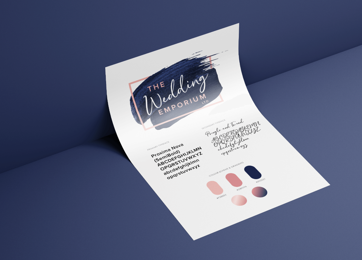
THE INITIAL STAGE
The process began with The Wedding Emporium requesting the new brand to connect to their already established business – but not directly relate to it. Therefore, we worked closely with the client on making their vision become a reality. As they came to the table with a clear idea of a colour palette and overall aesthetics, we were excited to produce the outcome.
Our team took their time researching the market to gain a sense of what was needed for The Wedding Emporium to stand out from competitors. We then incorporated this into their existing ideas and concepts to create a bespoke and pertinent logo design that is modern, memorable and suitable for online and offline media.
Pretty in Pink
Blushing Bride
Something Blue


project process
NEXT STEPS
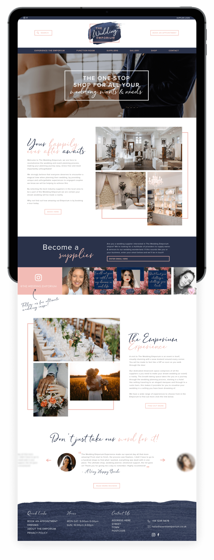
After the completion of the branding, we began designing the website, taking key elements from the logo to create a synonymous online presence. We kept the design contemporary, evoking high visual impact and retaining a neat layout to appeal to the target market.

Created by Nicky Laatz, stylish and unique, Pringle & Tweed is a new handwritten font with a graceful nuance.It’s gentle curves and natural lettering make it distinctive and elegant.
To make your lettering look truly unique, Pringle and Tweed comes with a comprehensive set of double letter ligatures, and a set of stylistic alternate lowercase letters in its opentype features.
Pringle and Tweed includes a slanted version for an extra elegant feel.

As The Wedding Emporium is due to operate in a physical brick and mortar space, we wanted the website to be as enticing as the emporium itself. By creating device responsive aesthetics, we can provide a seamless user journey from the users’ first online visit through to visiting the physical showroom.
We’re excited to watch The Wedding Emporium grow as a business, and we can’t wait to continue working with them in establishing their brand online!
See More