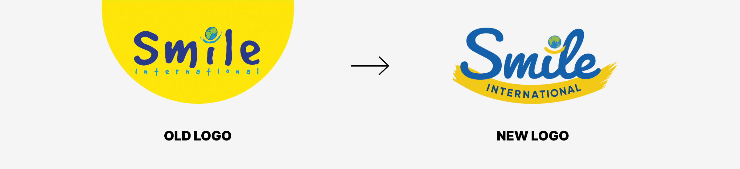
Smile International are a charity operating across the globe dedicated to giving hope to those in need and providing people with an opportunity to develop emotionally, physically, socially and spiritually. When they came to us wanting a much-needed brand refresh, we were more than happy to step in and help!
A Snippet of
The Requirements
After using the same branding for over 20 years, it was time to bring a fresh look to Smile International’s brand. We needed to keep their look friendly and bright, with a timeless feel that would last them many more years to come.
YEAR
2021
TYPE
Branding
project process
the initial concepts
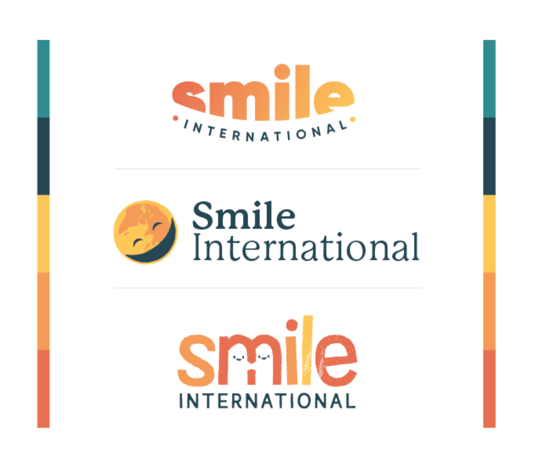
After our initial consultations with the client, we created three initial concepts that really pushed the boundaries of what the client had been used to for so many years.
We used different tones of blues and yellows in these new concepts to create a modern, different concept for Smile. However, after experimenting with such different themes, we all decided that we needed to go back to the drawing board and create something more recognisable to Smile’s previous look.
project process
reeling it back in
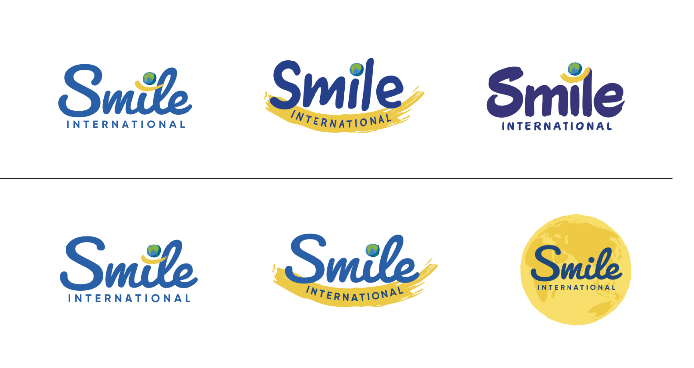
We decided to keep the colours much closer to Smile’s previous branding and accented the new typeface of the logo with a yellow ‘swoosh’ element. These concepts fit Smile’s vision perfectly, so it was time to refine the final design.
project process
responsive logo
We made sure that the final logo was versatile and recognisable in a variety of settings. We also created a favicon that made sure Smile International could still be instantly recognisable when using an image for their social media profiles or in other smaller spaces.
project process
brand guidelines
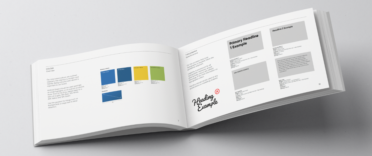
Once the logo had been finalised, we created a comprehensive set of brand guidelines so that the Smile International brand could be brought to life. We included all colours, fonts and incorrect usages of the branding to provide Smile with a comprehensive guide to using their stunning new branding.
Gilroy
Gilroy is a modern sans serif with a geometric touch. An older brother of the original Qanelas font family. It comes in 20 weights, 10 uprights and its matching italics. Perfectly suited for graphic design and any display use, Gilroy could easily work for web, signage, corporate as well as for editorial design.
Lapis Lazuli
#1460ab
Yale Blue
#09497d
Cyber Yellow
#f3c918
Android Green
#99bc44
See More