Bio
YMCA Trinity Group
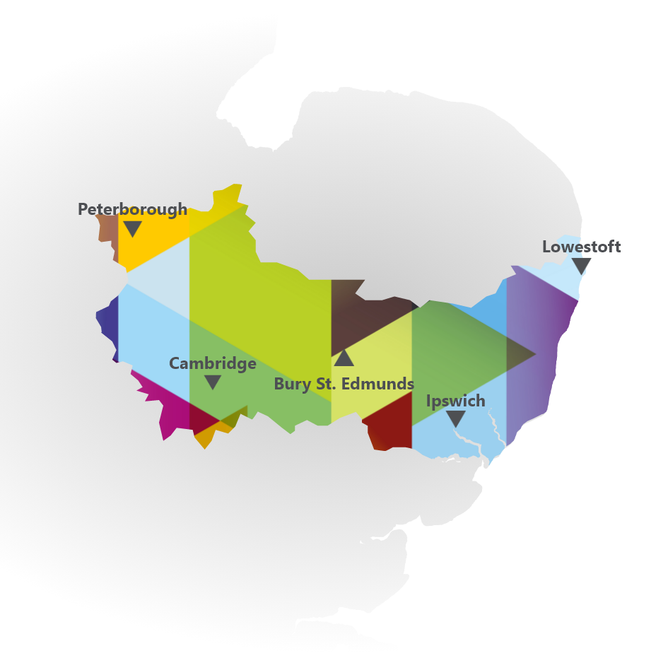
Peterborough | cambridgeshire | Suffolk
The YMCA (Young Men’s Christian Association) for Peterborough, Cambridgeshire and Suffolk came to us looking for assistance with a website redesign that ensured their charity work was seen as impactful but, most importantly, engaging with their target audience. The YMCA provides vital community services such as housing, camps, childcare, education, and health/wellness programs to people of all backgrounds, faiths, abilities and incomes.
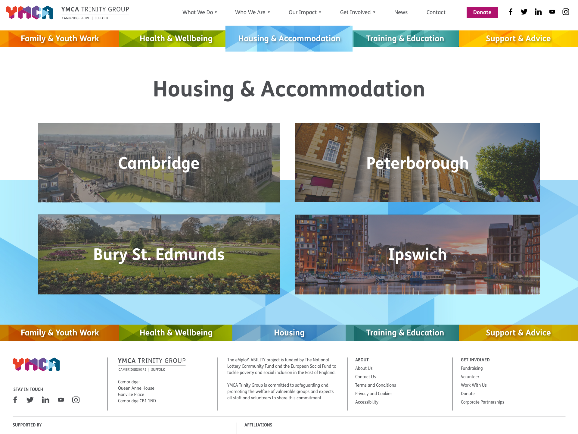
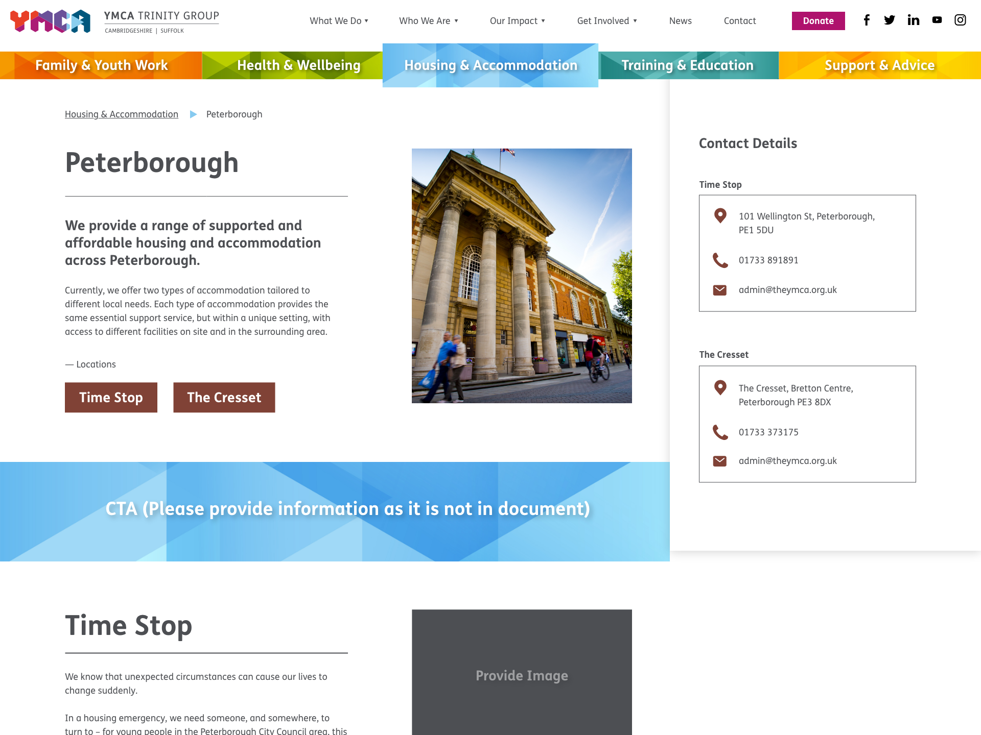
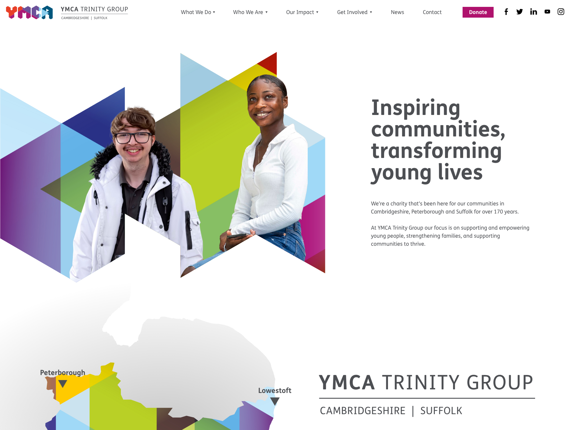
The YMCA website required an overhaul to modernise the user experience so people could find information on the YMCA’s community outreach programs, volunteer opportunities, donation options, and local branch locations seamlessly and not get frustrated. Our redesign focused on showcasing the breadth of the YMCA’s community impact in a clear, visually engaging way while making it easy for visitors to get involved and support this historic charity’s mission.
The Pain Point
The Pain Point
The YMCA’s website had become outdated over time and was in need of some revitalisation to engage visitors better. The organisation recognised that its online presence was not having the desired impact and was failing to convey the YMCA’s mission and services. They feared that the website’s dull aesthetic and poor navigation could be impacting their reputation. The team was concerned that visitors might be getting a negative first impression, which could dissuade them from learning more or taking advantage of the available resources.
These apprehensions were understandable, given that research shows 94% of initial impressions are related to visual design alone. This statistic highlights how substantial even minor design choices can be in influencing a user’s initial perception of a website. If the layout, colour scheme, typography or imagery fails to resonate with visitors, it becomes exponentially more difficult to earn their trust or interest.
An outdated, lacklustre website design also risks portraying an organisation as dated or insignificant. This can diminish their perceived authority and reliability in the minds of site visitors. Acknowledging these challenges, the YMCA team resolved to overhaul their website, which would better capture the YMCA’s vitality. Their goals were to improve site navigation, showcase the breadth of their programming, and utilise strong visuals to highlight the YMCA community’s diversity and passion. By optimising their online presence, they hoped to provide a seamless user journey that reinforced the brand’s identity and encouraged deeper engagement. The website transformation aimed to bring the qualities that draw members into YMCA facilities across the country onto visitors’ screens.
The team remained devoted to realising a website that would serve as a window into the spirit of community, growth and accessibility at the heart of the YMCA. With a well-designed, engaging website poised to greet the general public, the organization was on track to broaden awareness of its services and strengthen its outreach.
Seamless User Journey
Reinforced Brand Identity
Deeper Engagement
The YMCA’s website had become outdated over time and was in need of some revitalisation to engage visitors better. The organisation recognised that its online presence was not having the desired impact and was failing to convey the YMCA’s mission and services. They feared that the website’s dull aesthetic and poor navigation could be impacting their reputation. The team was concerned that visitors might be getting a negative first impression, which could dissuade them from learning more or taking advantage of the available resources.
These apprehensions were understandable, given that research shows 94% of initial impressions are related to visual design alone. This statistic highlights how substantial even minor design choices can be in influencing a user’s initial perception of a website. If the layout, colour scheme, typography or imagery fails to resonate with visitors, it becomes exponentially more difficult to earn their trust or interest.
The Solution
The Solution
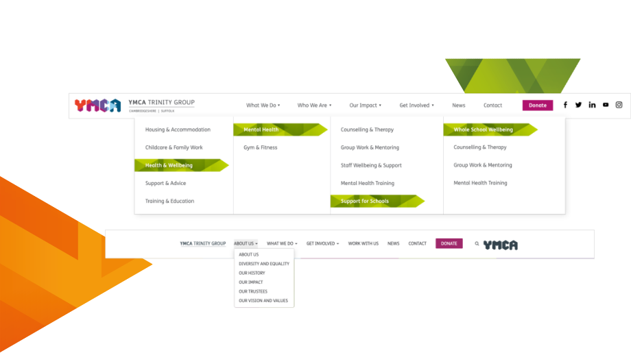
The YMCA team understood they needed to invest in their website design so they could pull users in. One of the main goals of the website was to streamline the whole website experience so users who needed to access information could so quickly. Geek’s core is to remove frustration from all websites, meaning any user on any of Geek’s websites, whether we have designed or developed it, will find what they are looking for instantaneously.
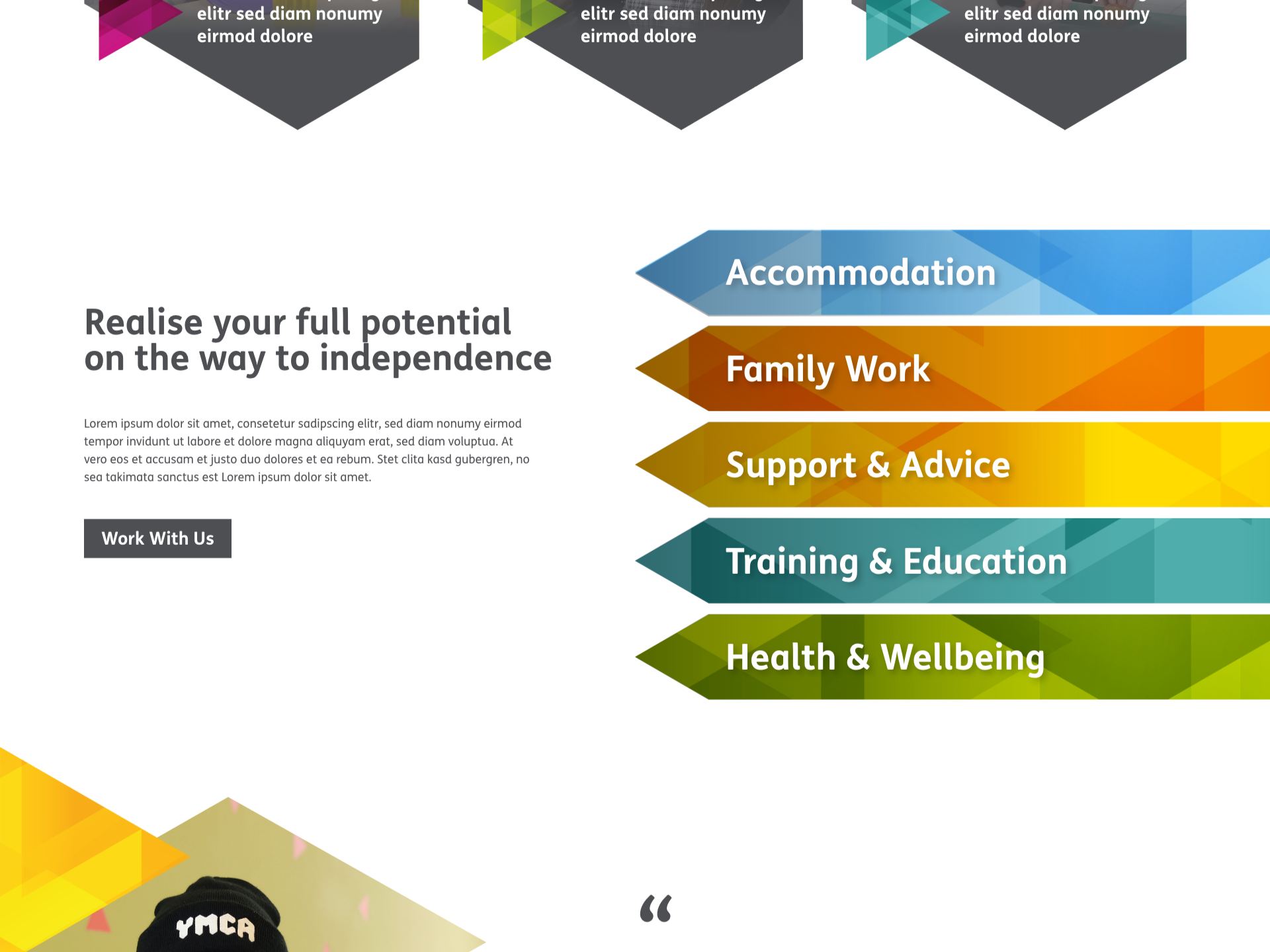
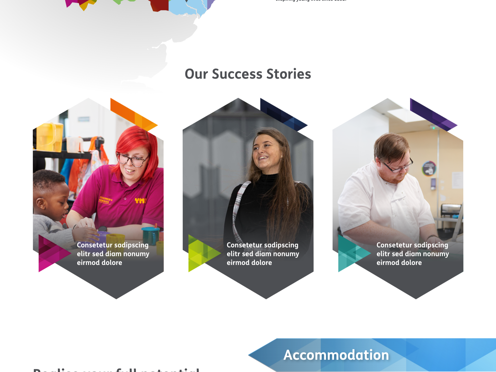
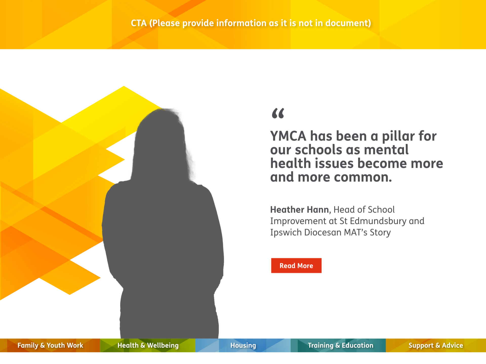
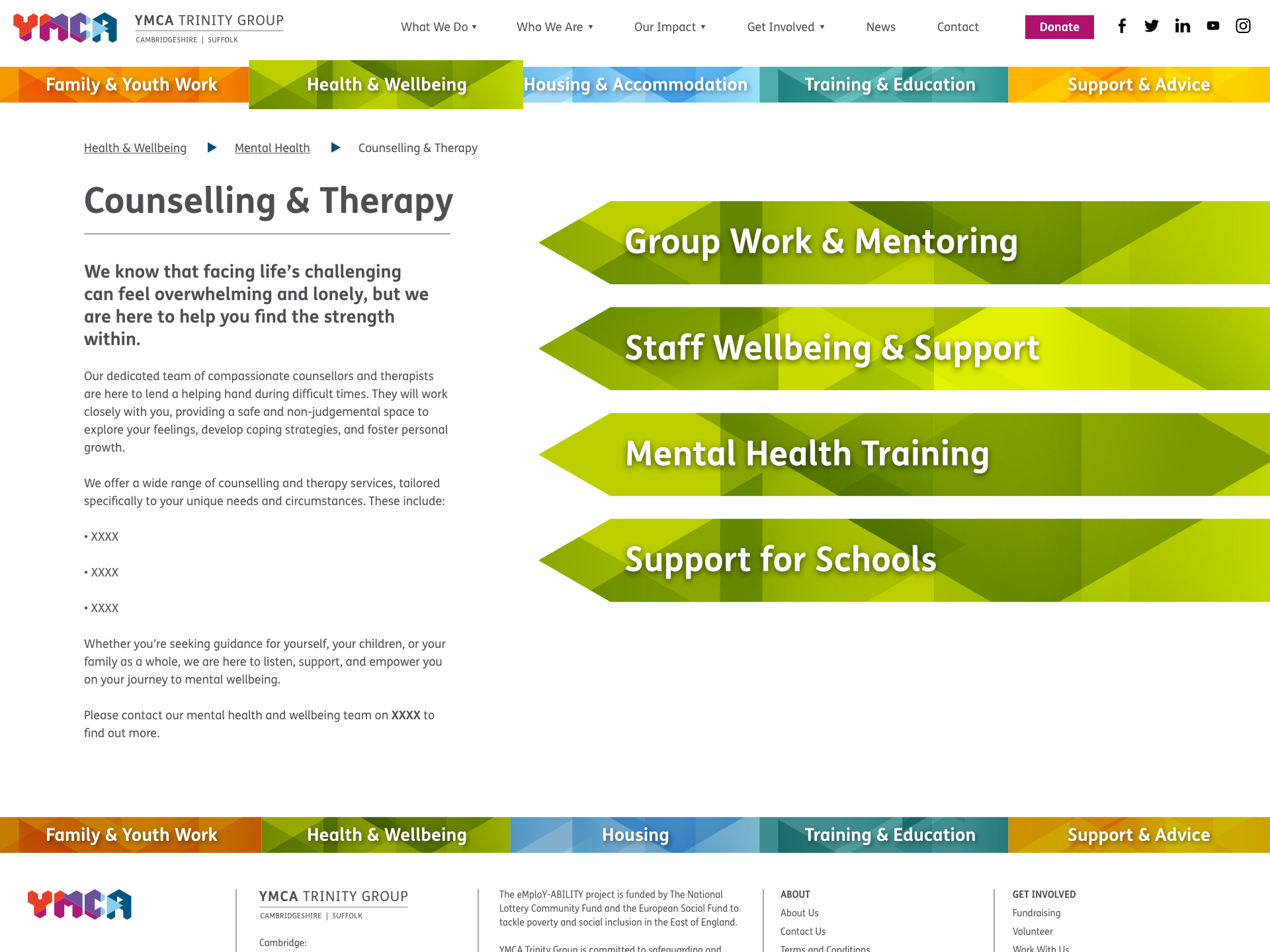
Through our conversations, we understood the need to shift the focus to case studies, testimonials and explaining what the YMCA do. This shift ensured people understood the critical, impactful work the YMCA does in various communities. We wanted to shine a brighter light on what the charity does so people can fully grasp who the YMCA are. Therefore, the new website encompasses iconography and illustrative designs, making the site more visual and helping to drive the YMCA’s core message.
See More