Parallax Hero Section for a Forward-Thinking Image
The homepage features a parallax hero section, which adds a layer of depth and dynamism to the browsing experience. This design technique not only captures visitors’ attention but also symbolises Flagship’s forward-thinking and innovative approach in their sector.
The Project Goals
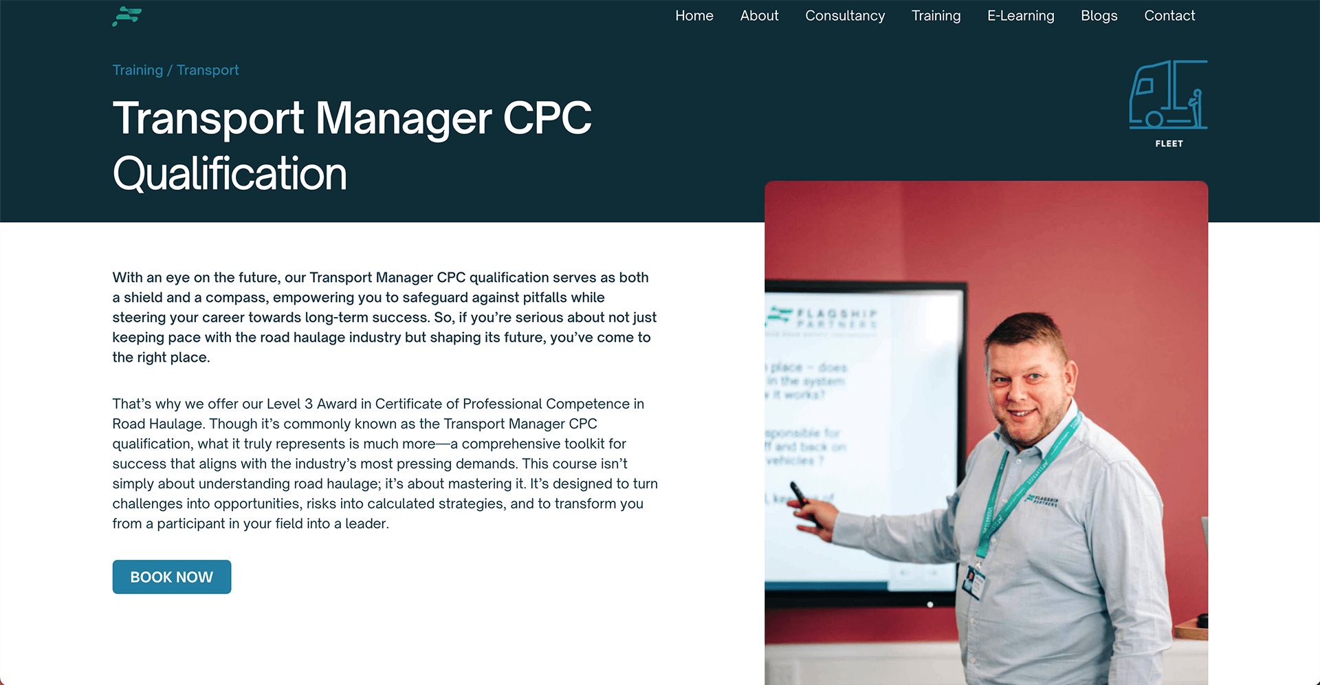
Flagship stands at the forefront of training and consultancy in the transport management and operator compliance risks sector. Flagship doesn’t just look at the present; they are committed to protecting the future of their clients. Through their consulting and transformative training programs, they empower their clients with the knowledge and tools needed to navigate the evolving landscape of their industry with confidence and skill.
Flagship, experiencing significant business growth, recognised that its existing website design and content needed to capture the essence of its evolving identity. Seeking a fresh perspective, they turned to Geek. The goal was to not only revitalise their branding across the website but also to revolutionise the content. The aim was to transition from solely focusing on SEO-friendly wording to delivering high-quality, educational content that resonates with the unique demands of their niche sector.
To enhance the website content
Voice Notes to Tone of Voice
Given that Flagship operates in a sector where information is paramount, their content needed to be not only educational but also distinctive, setting them apart from their competitors. To achieve this, we believed the content required to be deeply rooted in Flagship’s expertise. Therefore, we opted for a unique approach: Flagship’s employees, the very individuals who conduct the training and consulting, were asked to provide voice notes to our content writer. This strategy ensured that all content was not only accurate but also infused with the authentic essence of Flagship’s tone. Through these voice notes, a distinctive style emerged – one that is passionate, welcoming and reflects a profound level of knowledge. This approach has been instrumental in capturing and conveying the true spirit of Flagship.
_|
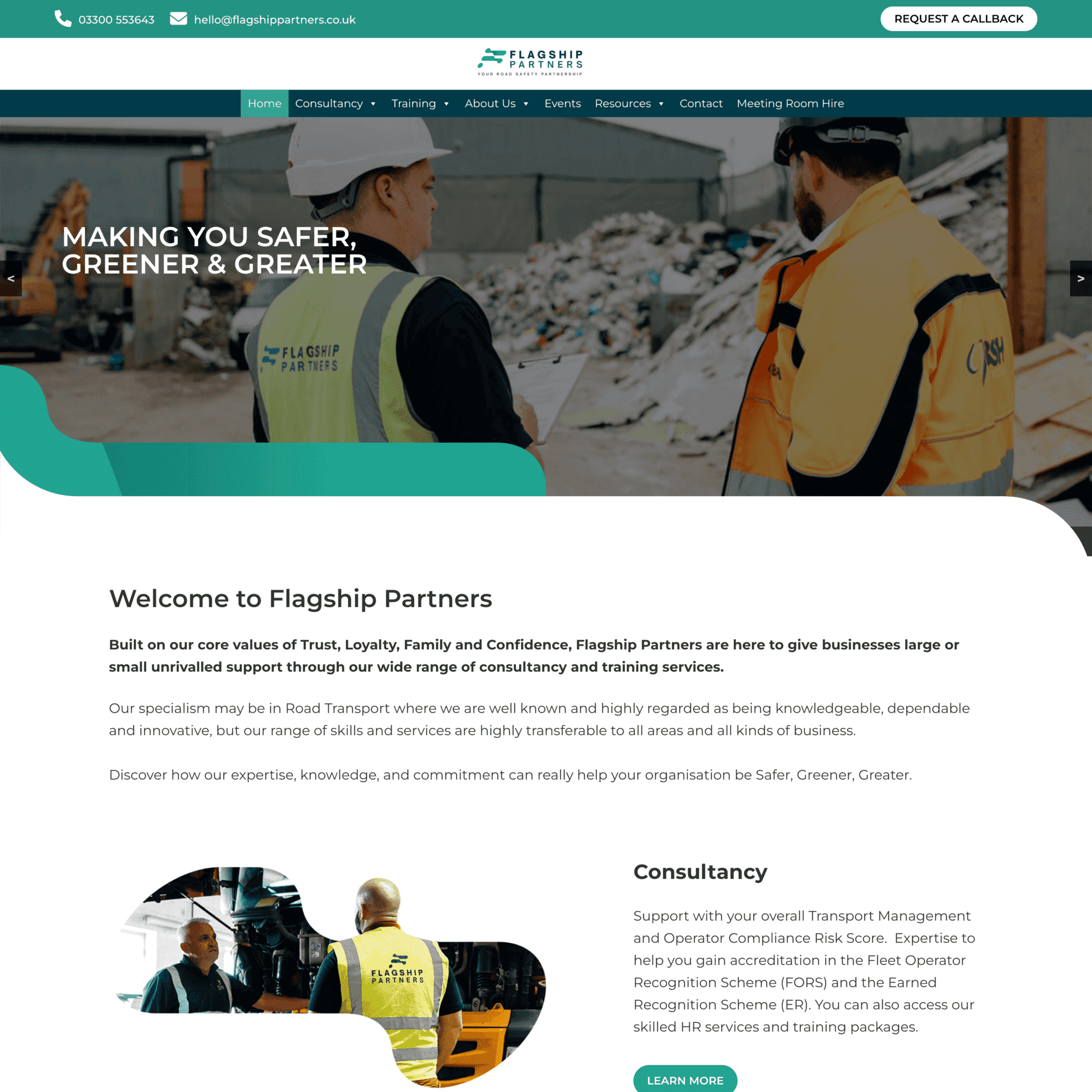
Making You Safer, Greener & Greater
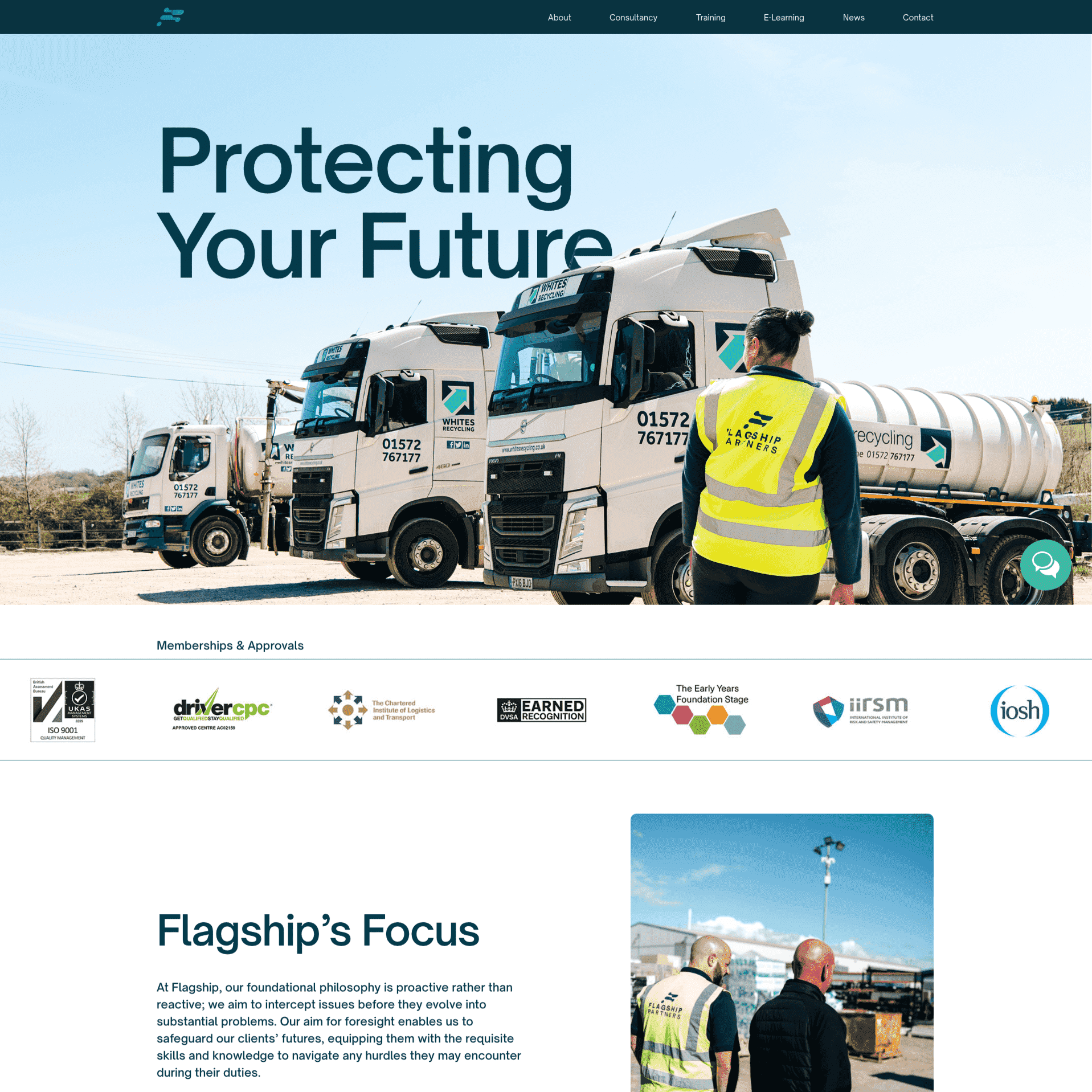
Protecting Your Future
Voice Notes to Tone of Voice
Given that Flagship operates in a sector where information is paramount, their content needed to be not only educational but also distinctive, setting them apart from their competitors. To achieve this, we believed the content required to be deeply rooted in Flagship’s expertise. Therefore, we opted for a unique approach: Flagship’s employees, the very individuals who conduct the training and consulting, were asked to provide voice notes to our content writer. This strategy ensured that all content was not only accurate but also infused with the authentic essence of Flagship’s tone. Through these voice notes, a distinctive style emerged – one that is passionate, welcoming and reflects a profound level of knowledge. This approach has been instrumental in capturing and conveying the true spirit of Flagship.
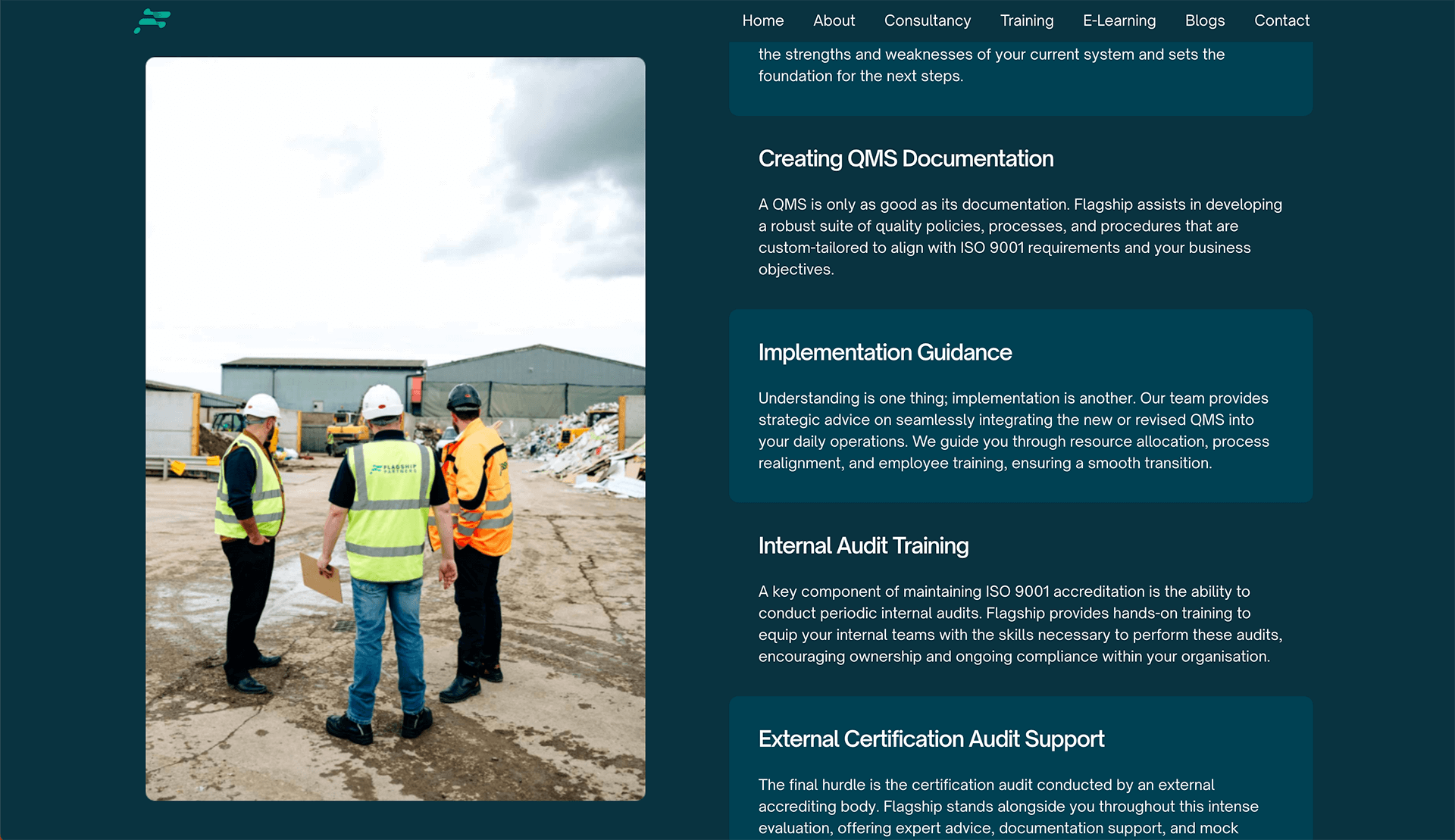
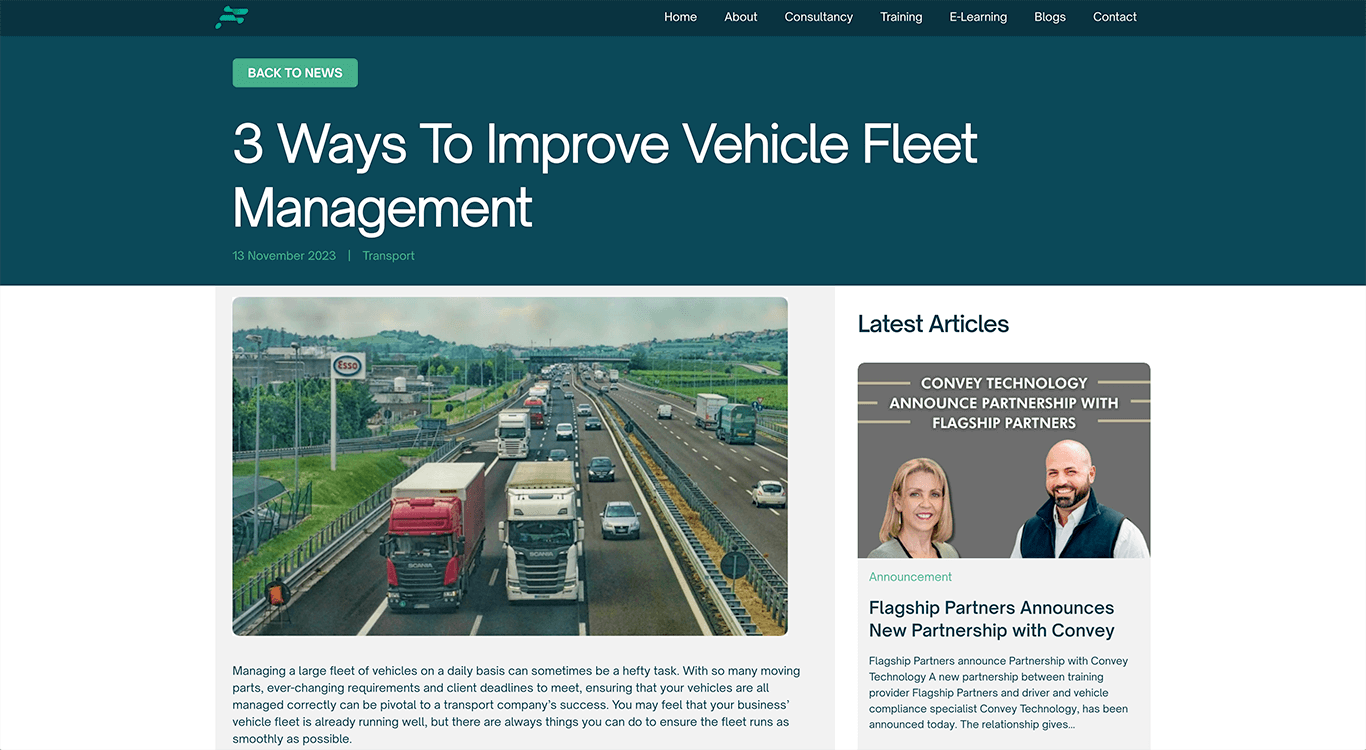
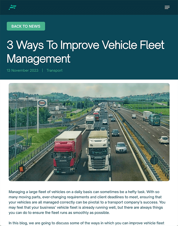
Making the most of professional photography
Flagship had a huge library of professional photography to utilise on the site. These were fantastic for giving the user an insiders view into what it’s like to work with Flagship, and therefore increasing the businesses credibility.
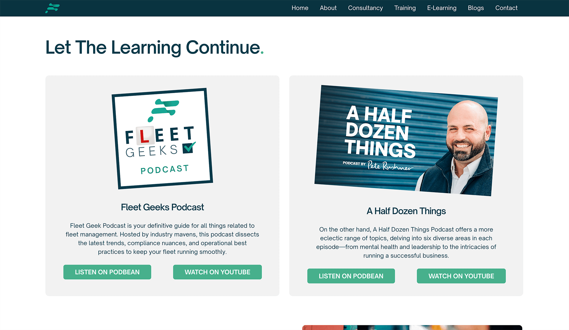
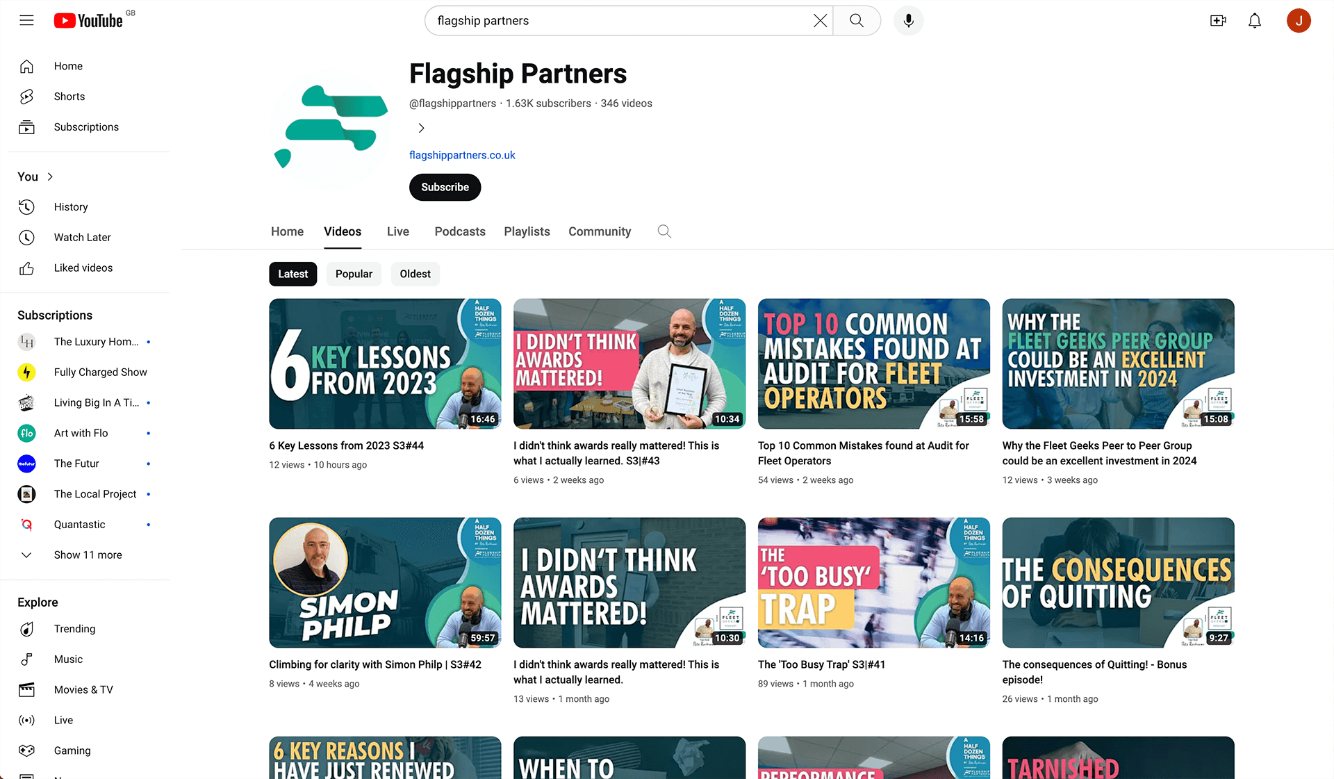
Pushing their huge video content library
Flagship also had a great library of videos and podcasts that we felt should be pushed more on the website as these give the user tonnes of insight and advice, which will build a connection and helps them get to know the people at Flagship, therefore putting them at ease when they meet face to face.
Design to reflect the growth of the business and evoke confidence amongst users
The primary intention behind this redesign was to create a website that not only resonated with Flagship’s current stature but also mirrored the significant growth and evolution of the business. As Flagship expanded and refined its offerings in the transport management and operator compliance risk sectors, there was a compelling need for its digital presence to reflect this progression.
Large Typography
Large, bold text is used throughout to draw attention to the content, ensuring that the key messages are immediately noticeable and easily digestible. This approach not only enhances readability but also aligns with modern design trends, making the website feel contemporary and accessible.
Colour Palette
The colour palette has been carefully chosen to mirror the Flagship’s logo as well as branding. This created a cohesive brand identity across the website. To give the website a more professional look we only used the bright colours as highlights.
Minimal Design
The website features a minimalist design, emphasising clean lines and uncluttered space. This simplicity produces a website that’s easy to follow and navigate.
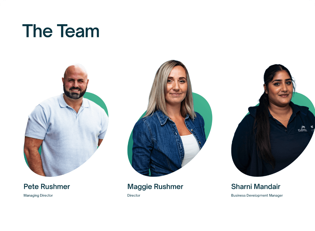
Team Section
Being transparent is great for evoking confidence amongst users, so the team section on the ‘About Us’ page allows the user to get to know the team. On hover, this section also shows what qualifications each member of the team has that are relevant to their role..
Drag left to view more
A seamless user experience while looking for and booking a course
Full-Page Mega Menu for Clear Navigation
Navigation is made effortless with a full-page mega menu. This feature provides a clear and comprehensive overview of the website’s content, making it easy for users to find what they’re looking for quickly and efficiently.
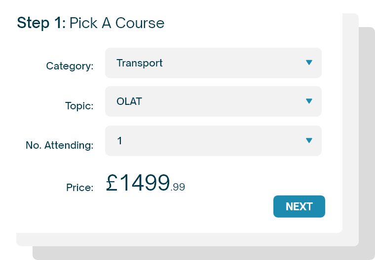
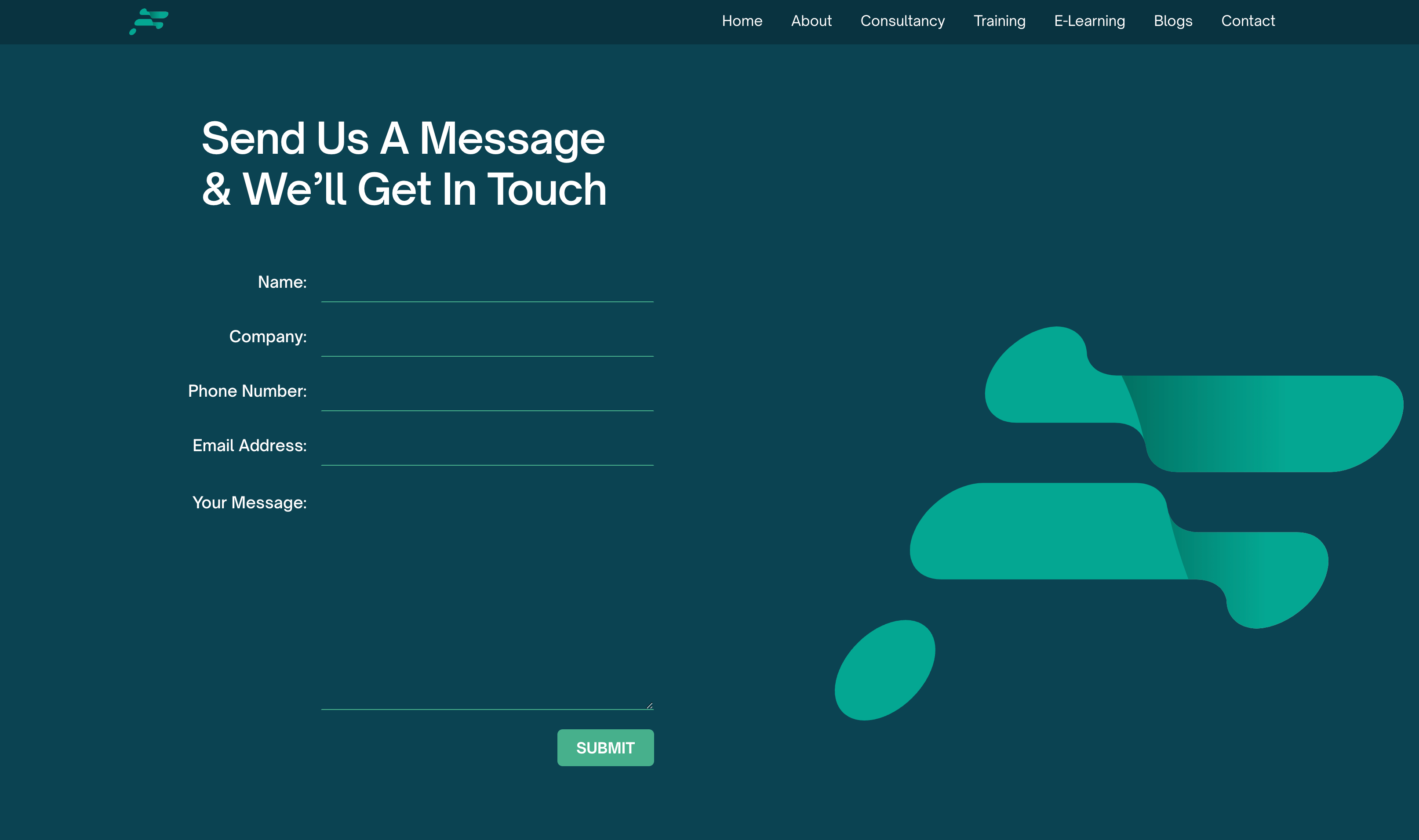
Custom 3-Stage Booking Form for a Streamlined User Experience
To simplify the user journey, a custom 3-stage booking form was integrated into the website. This form breaks the booking process into manageable steps, making it user-friendly. The design of the form is intuitive, guiding users through each stage with clear instructions and feedback, resulting in a seamless and enjoyable experience.
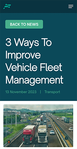
Fully Responsive
We build all of our websites to be fully responsive, meaning the website is ready for any device. We also ensure the website works on all browsers (e.g. Chrome & Safari).
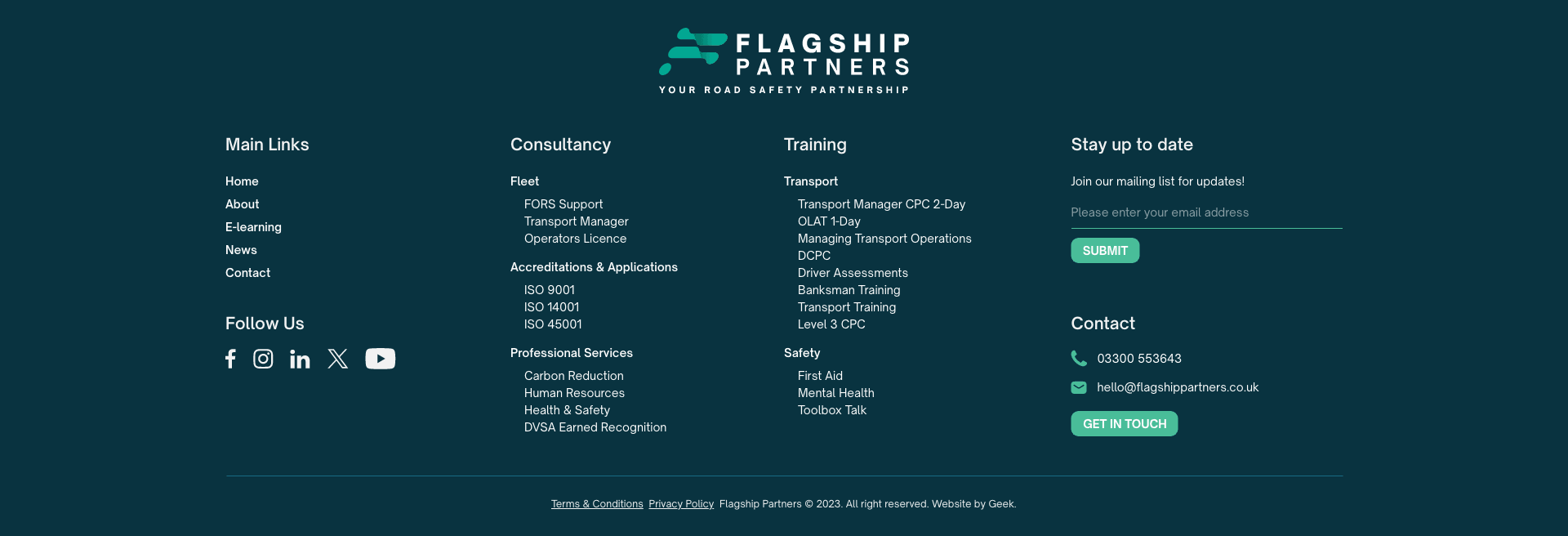
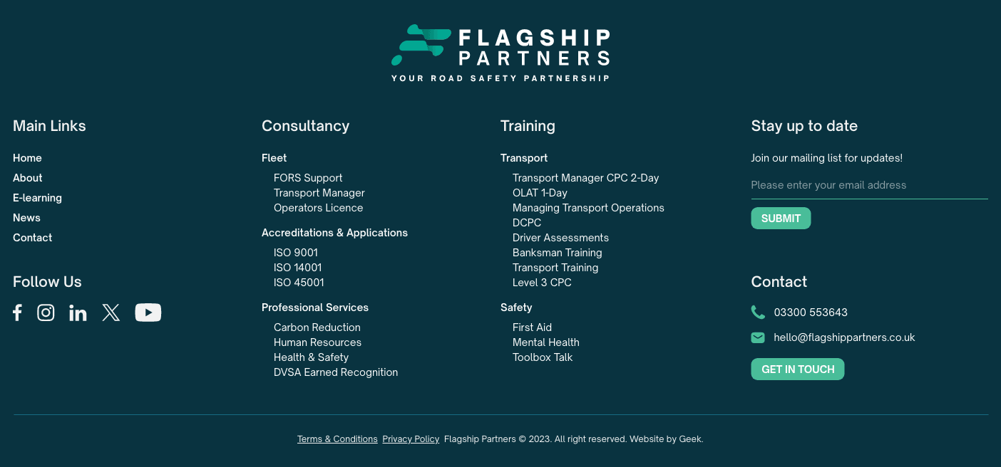
Footer Design
To ensure the user doesn’t hit a dead end when navigating the site, the footer has been designed to make it easy for them to find the page that they want to go to next if they get to the bottom of the page without finding what they need.
See More