
Logo Journey
Logo Journey
Logo Journey
Logo Journey
Logo Journey
Logo Journey
Design Exploration
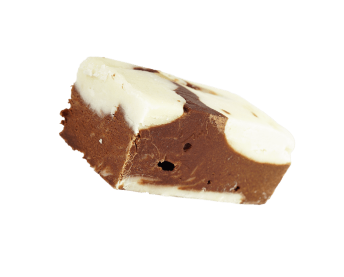
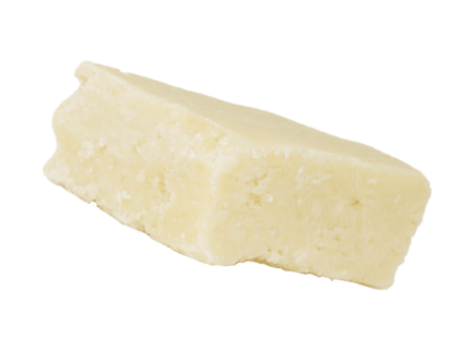
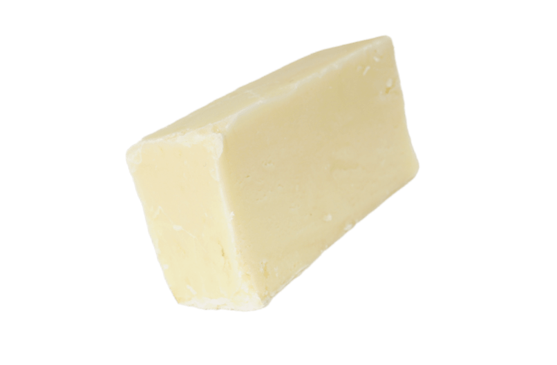
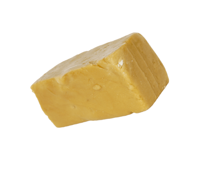
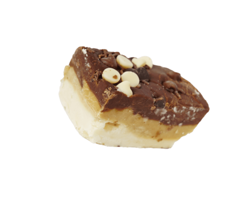
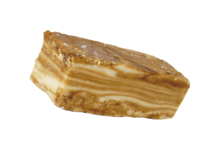
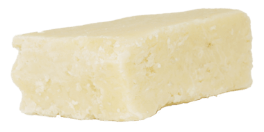
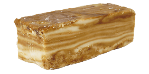
To begin all of our branding projects, we start by thinking about the goals of the company and the message they want to portray. We look at their competition and design trends to ensure the new branding is current and also stands out from the crowd. With Gluttony, we wanted to portray that the fudge they sell was luxurious and also a little bit naughty, a refreshing escape from all of the health-focused food brands around. We also found that fudge originated in Baltimore, Maryland, USA, on Valentine’s Day in 1886, which largely inspired our retro American design for Gluttony. We experiment with a variety of logo styles, which you can see below before a concept is chosen to go forward with, which is then developed even further into the final logo.
Colour Scheme
Colour Scheme
Colour Scheme
Colour Scheme
Colour Scheme
Colour Scheme
Choosing a Colour Palette
We explored a range of different colour palettes and effects on the logo before the final colour palette of red, cream and charcoal was chosen. The shade of red that we decided to use emphasises both the retro American style and the naughty feel of the branding, and the charcoal and cream combination also gives the retro feel whilst having good contrast, which is essential for the versatility of the branding.
“Design is the silent ambassador of your brand”
Paul Rand
Packaging Concepts
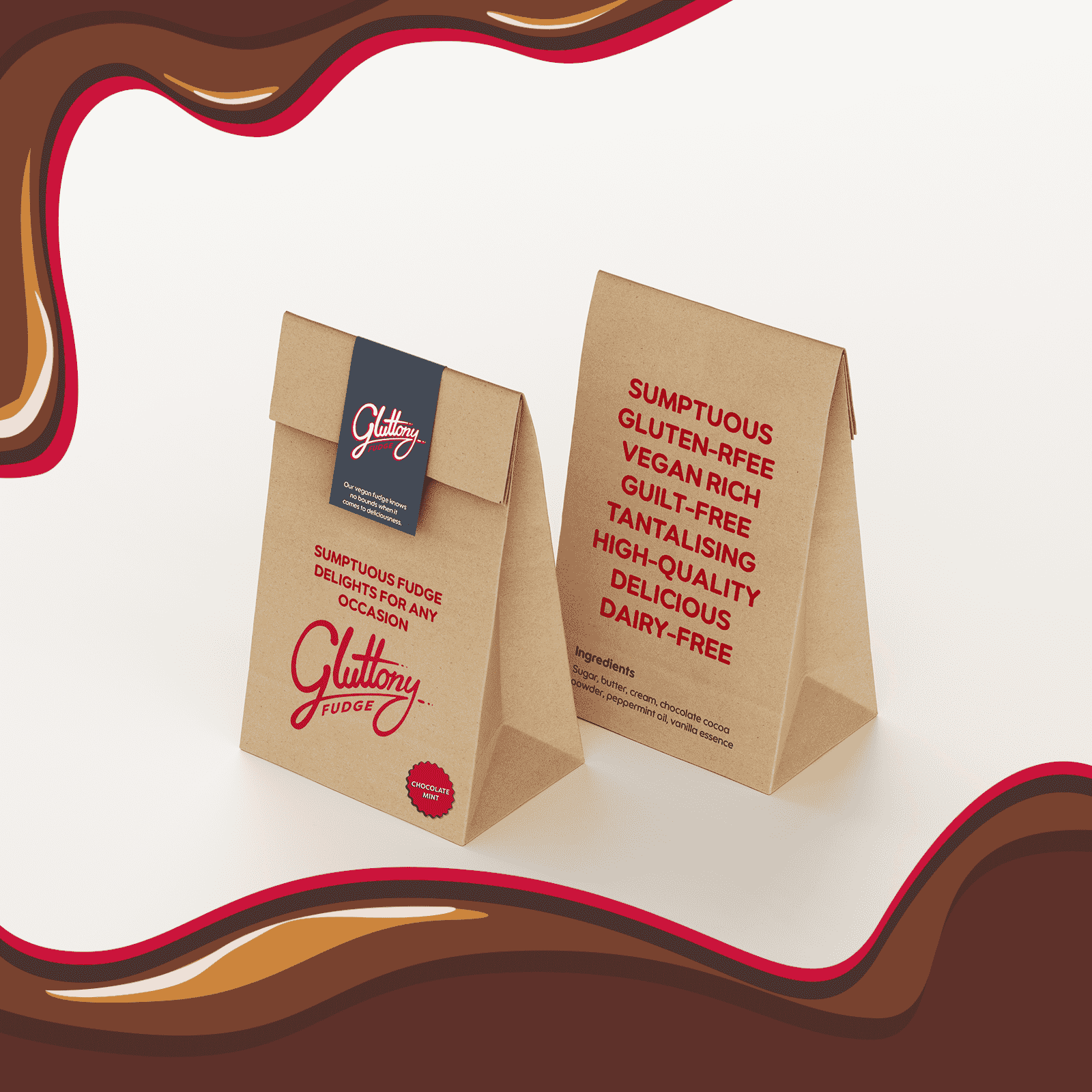
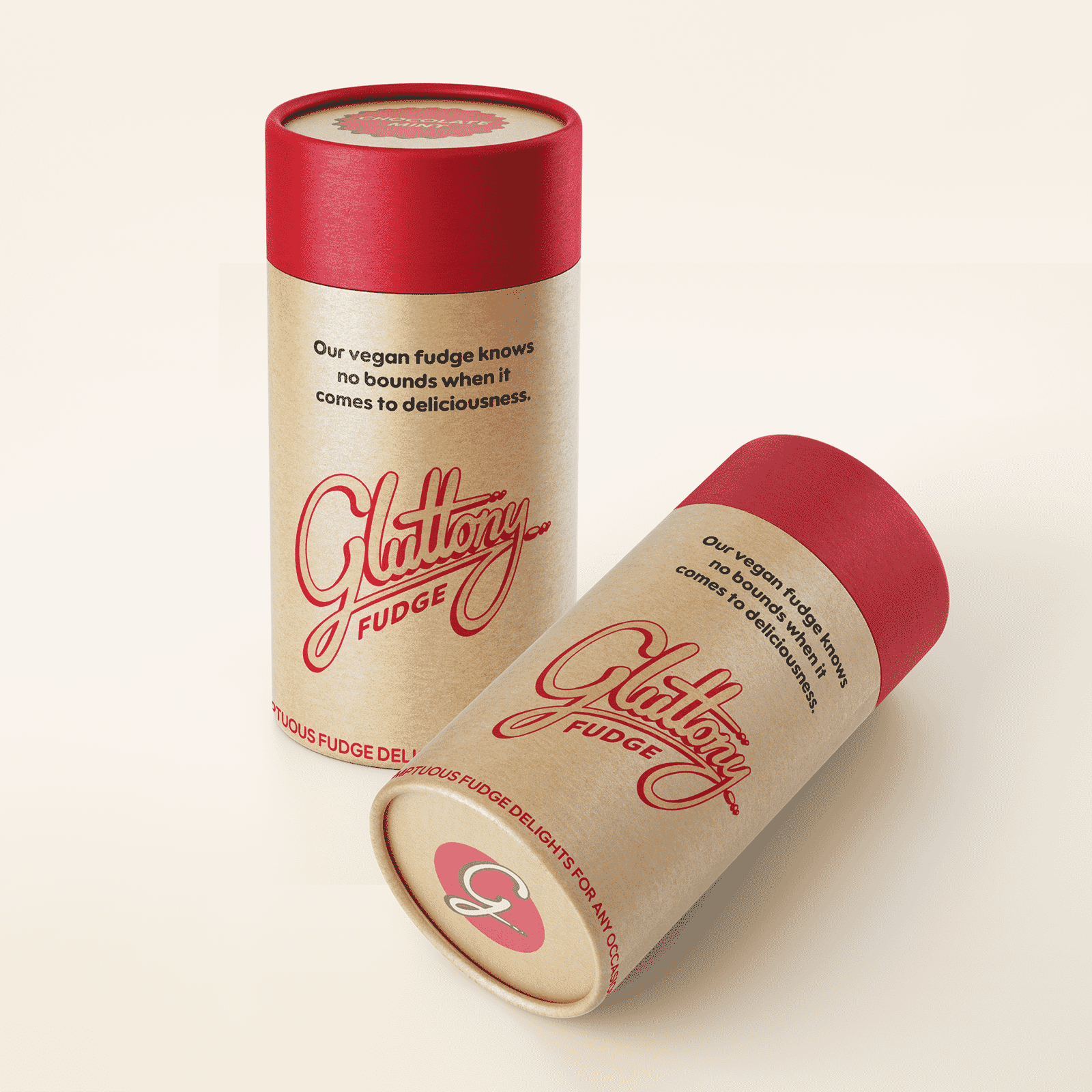
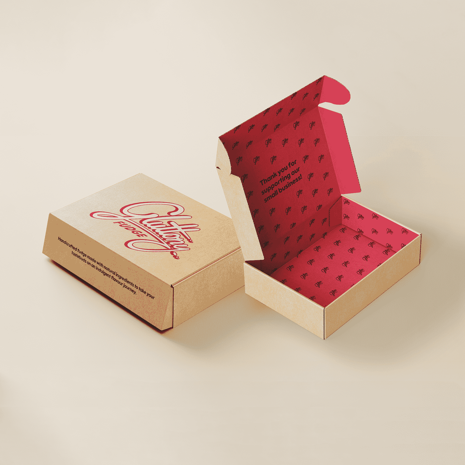
When we first spoke to Gluttony, they had some sample cardboard boxes that they were going to use for the first packaging designs, so the cardboard texture was considered in the design process right from the start. This turned out great for the branding as it complemented the colour palette well, and the recyclability of the material and the fact that we could print directly onto it to reduce packaging showed that the company cares about its environmental footprint.
A key consideration for our packaging design was their versatility. By having a generic design that you could add a sticker with the flavour onto, we could reduce print costs and make them more futureproof at the same time.
Typography
Typography
Typography
Typography
Typography
Typography
Typeface Name
LT Saeada
Typeface Name
LT Saeada
Heading 1
LT Saeada Bold
Heading 2
LT Saeada Extra Bold
Heading 3
LT Saeada Black
Paragraph
LT Saeada Regular
Heading 1
LT Saeada Bold
Heading 2
LT Saeada Extra Bold
Heading 3
LT Saeada Black
Paragraph
LT Saeada Regular
See More